Hi everyone and a warm welcome to the Winter Wishes Blog Hop!
Warm thoughts are unfolding, as we begin to enter a festive time of year.
Eileen, Kim and The Teams have created a fun blog hop challenge to kick off the American Thanksgiving and Winter festivities.
I am thrilled to be sharing this project I designed for the hop
sponsored by
Emerald Creek Craft Supplies and
Eileen Hull. Be sure to read through to the end for all the details of the blog hop and giveaway.
It is no secret that both of these companies manufacture some of my favorite products to use. Today I am sharing a winter wedding planner that I have created using the Eileen Hull Journal Die and showcasing the gorgeous stained glass window stamp from Emerald Creek along with some of their amazing embossing powders. The Emerald Creek embossing powders are truly unique and create the most magical finishes. I have been using them for a long time and they have become a staple among my crafting supplies.

So many people like to take advantage of winter's beauty when choosing a wedding date. There is something magical about the snow on the ground and the chill in the air. I wanted to create a special keepsake journal with spots to tuck ideas into; begin the many to do and who's who lists that are needed, and simply organize all of the details that go along with planning a wedding.
For the base of my project I have chosen an Eileen Hull Journal. This is a very versatile die and the cuts can be customized in so many ways. I chose it for the height, which easily accommodates the Emerald Creek
stained glass art stamp that I am showcasing on the cover. The base pieces are die cut from a medium weight chipboard. I ink only the edges of the stamp onto the chipboard cover, and then, using an Exacto knife, I cut out the shape just beyond the stamped line. This will ensure that when the stamped and colored piece is placed within the opening, the embossed edges will show.
With the altered cover as a guide, I trace the cut opening onto a piece of Bristol board.
I apply texture paste with a palette knife through the stone pattern stencil, and create a "wall" of stone. This is set aside to dry. A second piece of bristol is cut to fit the back cover of the journal and the stone pattern is applied to that piece as well.
While the stone pieces are drying, I cut a piece of bristol that is long enough to span the entire inside (interior front, spine and back.) This piece of paper is scored at each of the locations that will need to bend. The piece is then slipped into the base journal and the "window" opening is traced onto it. The opening will be cut out from the interior covering so that when assembled, the front cover will simulate a window within a wall. I want the interior of the wedding planner to appear as if it is the interior walls of a stone chapel. I ink the bristol with antique linen distress ink, then using a stencil pattern that looks like something you might see in an historic building, I apply embossing ink through the stencil.
Vintage beeswax baked texture embossing powder is sprinkled over the embossing ink and heat set. I continue this process until the entire interior covering has the pattern applied. When cooled, the "window opening" piece is cut out using an exacto knife. This decorative interior covering is set aside. The actual window piece will need to be completed and attached prior to the attaching the interior covering.

Once the stone patterned pieces have dried, I color the stones using distress inks and a water brush. I usually mix or choose a color and paint random stones within the entire pattern before working with the ext color. This helps to make sure all of the colors are spread throughout the complete design as they would be if a mason was laying a stone wall. The different colors blend visually, but each stone maintains its unique appearance. When all of the stones have been colored and are dry, I coat the pages with micro glaze and buff off. The micro glaze will set the inks so that as the journal is used the inks will not reactivate.

I tend to be unconventional when covering my journals, oftentimes the decorative cover material is adhered to the base material prior to cutting the piece, but I prefer to secure the covers together at the spine and later add my finished coverings and trim to fit. I attach my front and back base pieces along the spine with distress collage medium and clamp them together until dry. Next, I attach my stone patterned paper to the back cover with collage medium. I set weights on the paper so that it remains flat. The front decorative stone piece is also attached with collage medium and weighted down until the glue has set. The spine of the journal is covered with a strip of mixed media heavy stock that I have dry embossed with a 3D texture fade and colored with inks and paints to make it look like the wood of an old chapel door.

Before moving ahead, I coat the inside edge of the window opening with embossing ink and use
charred gold embossing powder to create the illusion of a leaded opening.
Now it's time to complete the showpiece of the planner, the stained glass window. I intend for the window piece to be translucent as a typical stained glass window would be, and use a vellum paper as the base in order to achieve this. I stamp the Emerald Creek stained glass stamp with versamark onto vellum and sprinkle charred gold embossing powder over the image. This is heat set and allowed to cool.
When the powder has cooled, I color the image using distress inks and a water brush. I love the vivid colors that can be achieved when using inks to color and yet they remain translucent, allowing the light to shine through. When the ink is dry, I turn the colored image over. The main outlines of the stamp image are traced with a versamark pen and then embossed with the charred gold powder. When the window is in place and the planner is in the open position, it will appear as a window to the exterior.

I cut out the window, leaving approximately an inch all around the edge. This allows me area to attach to the base cover, when securing the window into the opening. The finished window is attached to the inside front cover, between the chipboard base die cut and the interior stenciled and embossed bristol piece. From the outside of the journal the window looks "set into" a stone wall. Here are some detail views of the front and spine of the wedding planner. The final step when assembling the planner is to add charred gold embossing all along the outside edges. I love this finishing touch, it adds such a beautiful detail.
On the inside cover, I added a window sill piece cut from the same "wood finish" paper as the spine, below the window. I also attached a piece of parchment paper that has a stamped embossed image of the definition of love. This image was embossed with
moss stone embossing powder. It is a very fine powder and captured the small text of this stamp perfectly.
The interior of the planner contains three distinct parts or signatures as they are sometimes called. Each signature is broken down into different sections. I created the signatures from mixed media paper so that they could easily be customized and would withstand markups, collage, and other modifications. I assigned titles to each of the three signatures: ideas, event, and guests.
The first signature, "ideas", has a section that can be used for gathering dress inspiration clippings or sketches; a second section for wedding theme and venue information, and a third section for invitation preferences.
In order to designate the three different sections of the "ideas" signature, I trimmed the pages and added a decorative edge to each section. The first section is stamped with an ornate trim stamp and embossed with charred gold embossing powder. The two remaining sections are edged with distress glitter design tape.
Perhaps the bride to be has some magazine clippings that she has always dreamed her wedding would be like, these can easily be glued onto the papers with copious notes added.
For the exterior of this signature I stamped and embossed the word "ideas" with charred gold embossing powder onto shimmery cardstock and then embellished the top and bottom with inked die cuts of festive holiday greenery. I intentionally left the center of this signature simple so that it would not detract from the transparency of the stained glass stamp when the planner was in the closed position and viewed from the exterior.
The second signature, "event", is covered with christmas collage paper and edged with charred gold embossing powder.
The title is also embossed with charred gold. This section could contain all the details for the ceremony, music and flowers.
While planning my own wedding, I really focused much of my attention on the selection of readings and music. This was a very important part of the special day to me. I wanted to be sure that there was ample room for all of these important details in this signature, as well as pages for preferred flowers and types of arrangements and bouquets. The divisions of this signature are kept simple with trimmed edges and charred gold embossing of different patterns along the leading edges.
The third signature "guests" has a few different pockets and places to tuck things, as well as three tabbed sections. This is where all of the information surrounding the invitees would be located.

On the cover of this signature, the title is embossed in charred gold embossing powder as well as a couple of decorative stenciled images to coordinate with the interior of the planner. The inside cover has a pocket for tucking important papers. A "gather" flashcard is edged with charred gold.
Three tabbed sections can be used for guests list, table arrangements, and gifts.
Spiced candy aroma embossing powder is used as an accent on the back cover of this signature.This embossing powder creates a lovely red translucent finish and has the smell of cinnamon candies when it is being heat set. I love the pop of color it add to this signature.
There is a stitched slots die cut attached to the back cover as well, providing a great spot to store an rsvp list or gift registry information.
Each signature is secured in the book by an elastic that has been threaded through the spine and tied together. This type of binding allows the signatures to be easily removed and replaced, giving you freedom to use the cover and/or the signatures for entirely different purposes. Perhaps after the wedding this might become a place for you to keep your favorite photos and memories of the special day, or honeymoon. It might just remain as is to be cherished and shared over the years.
Thank you so much for stopping by, I hope that you have enjoyed seeing how I created this winter wedding planner. If you are are interested in creating some journals, this Eileen Hull die is definitely one to check out, and I highly recommend the Emerald Creek supplies, I can honestly say that their embossing powders are my absolute favorite to use.
Wishing you a Happy Thanksgiving and a wonderful winter season.
~Ann
Don't forget to follow along and comment on all of the wonderful stops along the hop. The designers have put together some incredible projects to inspire you, and I, myself, have been so impressed by the wonderful designs of each and every one. You should have arrived here from Pam Bray's blog, but if not, feel free to start at the beginning, you don't want to miss a thing!
Here is the list of designers with their links:
To play along all you need to do is follow along and comment on every blog. If you play along and link up your own creation using Eileen and Emerald Creek products, you will get 2 bonus entries for the draw. Contest Closes on Sunday November 25th, with the Winner announced Cyber Monday!
Prize includes an Eileen Hull Journal Die and a $50.00 gift certificate to the Emerald Creek Shop.
Supplies used to create a winter wedding planner:
chipboard (medium weight)
Distress collage medium: matte
Distress ink:
antique linen, black soot, candied apple, dusty concord, fired brick, fossilized amber, gathered twigs, hickory smoke, iced spruce, peeled paint, pumice stone, victorian velvet
tea dye, weathered wood, walnut stain,
Eileen Hull Sizzix
Scoreboard XL Journal die
Emerald Creek art stamps:
stained glass
Emerald Creek embossing powders:
charred gold allure,
moss stone,
spiced candy aroma,
vintage beeswax
Ranger texture paste: opaque matte
Tim Holtz Ideaology:
design tapes, paper stash christmas, christmas alpha stamps, christmas collage paper,
Tim Holtz/Sizzix alterations dies:
fold-up bows, funky festive, holiday greens mini, holiday greens, stacked deckle,
stitched slots, vintage tidings,
Tim Holtz/Sizzix alterations 3D texture fades: lumber
Tim Holtz/Stampers Anonymous stencils:
THS026, mini THMS085
Tim Holtz/Stampers Anonymous:
correspondence, love struck, ornate and lace, ornate trims


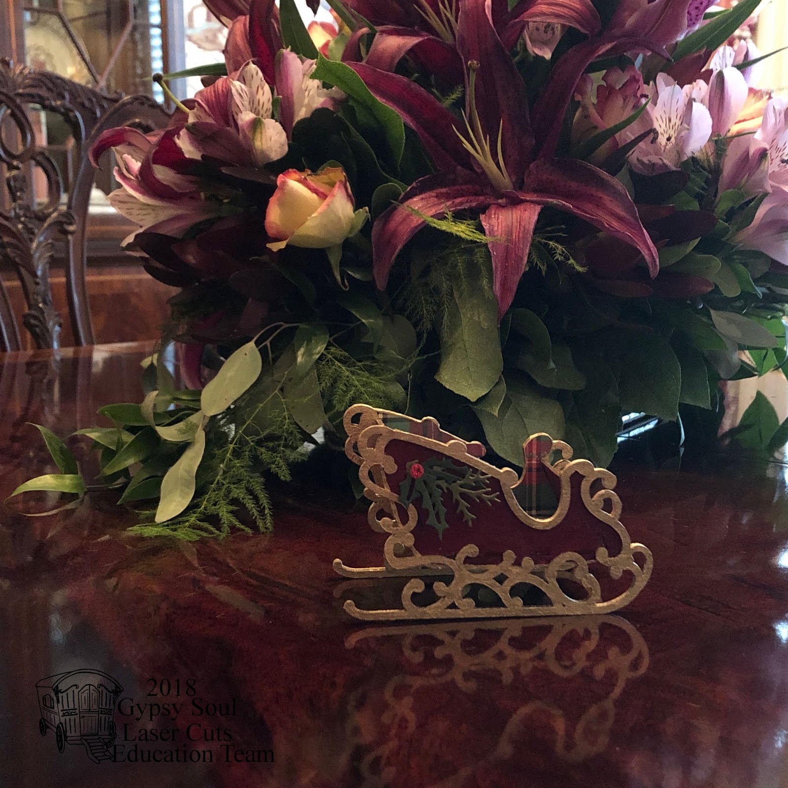
 The sleigh ornament arrives flat in seven pieces. Carefully remove the pieces from the background, using a sharp blade where the connections remain. The piece is easy to assemble by inserting the tabs into the slots. I always like to do a test assembly so that I understand the areas that will be exposed as well as the areas that will be concealed beneath trim pieces. It also allows me to visualize and generate ideas for the finished piece.
 Our holiday table is set in the traditional manner and gives off a sense of formality, that is played down with the centerpiece. I want the sleighs that will be placed at each setting to reflect this. I decide to paint the exterior of the sleigh a deep rich red and then cover the interior with a traditional holiday plaid paper. The ornate decorations on the sleigh will be finished in gold.
 While the main pieces are drying, I coat one side of each of the ornate trim pieces with gilding. Be sure that when you are applying the gold finish that you are doing opposite sides on the two pieces. I try to keep the side that will be adhered to the sleigh base unaltered so that the adhesive will attach easily. I flip the main sleigh side pieces over and coat the interior of the runners as well as any exposed and decorative edges with the gilding. This will ensure that when the sleigh is assembled, all areas that can be seen will be finished.
 Using the main sleigh side pieces as a guide, I trace the shape onto the plaid paper. Be sure to use the inside edges of the tabbed holes as your guide so that the paper covering will not prevent the tabs from inserting into the holes. Cut out the paper shape with a pair of sharp scissors. Also cut a strip of plaid paper the interior width of the sleigh. Measure and crease the paper so that it fits snugly into the base of the sleigh and up the back of the interior compartment.
 Next it is time to assemble the sleigh. Using a clear, quick dry glue I add a thin line of glue between the tabs and insert the base pieces into one side. Next I attach the front panel and the back piece of the compartment into that same side. Push all the tabs securely into their respective slots and allow to set up for a few minutes. Run a thin line of glue along the unattached sides of the pieces and then align the tabs with the holes in the opposite side. Gently push the tabs into their respective holes and allow to dry completely. Adhere the cut papers to the interior compartment of the sleigh. Turn the sleigh onto its side. Apply a thin line of glue to the unfinished side of the decorative trim piece and align with the edge of the sleigh side. Clamp into place until dry. Remove clamps, flip the sleigh over and repeat this process.
 The sleigh is ready to be filled with goodies and set at each plate. I am looking forward to using these for our holiday dinner, but can also see this as a great hostess gift with a fir sapling placed in the compartment or even as a small gift for a friend, filled with peppermint puffs, and the ornament string attached ready to hang once the treat is finished.
 I hope that you are able to spend some time being creative this holiday season, whether it's in the kitchen or the craft room, it makes it special when you make it yourself.


