Monday, October 24, 2022

hallo(DEX)ween collaboration for StencilGirl®

It's an All Hallows' Eve Masquerade at Lost Souls Garden and the guests have traveled from near and far to join in the fun!  Follow along as I introduce you to everyone...  
For this collaboration project, we were each asked to create a Halloween themed piece using StencilGirl® stencils and a chipboard roloDEX tray and cards by UmWowStudio. We were to use any other supplies we wished for the theme, and to let our imaginations take us where they may. The pieces created by each artist are truly wonderful, each a unique representation of the artists' style. It is definitely worth a hop over to the StencilGirl® Blog to check them all out. You can click here to visit.

Now, onto the details for my All Hallows' Eve Masquerade Attendees inDEX.
I began by assembling the tray, using glue to secure the pieces in place. Once dry, I spray painted the base tray black. The exterior sides were covered in backdrop paper (by Tim Holtz). Next, I traced the Botanical Wildflowers stencil (L774) onto black paper and cut out the pieces by hand. These pieces were then glued onto the outside of the tray to create the "garden." An inked Idea-ology quote chip and resin skulls (for feet) were added to complete the base tray. 
With the base tray complete, it was time to begin creating the cards that would fill it up. I wanted to create a garden gate to welcome all of the guests. Using a retired Tim Holtz Sizzix die, I cut two Gothic Gates out of heavyweight paper and adhered them together leaving the bottommost edges separate. the two bottoms were then glued to either side of a painted spine that would slide onto the DEX rails. Tiny type uppercase die cut letters were used to form the words Lost Souls Garden, and Golden bronze irridescent paint highlights were added. 
To further create the setting, I added a spooky moon with bats and shadowed vines. Using a half circle tall card, I painted a base layer of Golden bronze iridescent, then stenciled the Linear Textures (L857) vines with black gesso. The bat confetti pieces were painted with gesso then glued onto the "moon".
The next piece we encounter is the Masquerade announcement, an altered Idea-ology baseboard frame. The highlight of the announcement being the reverse side, where I used the Botanical Wildflowers (L774) mask and lightly applied the Golden bronze iridescent paint around it, creating an ethereal appearance.
The line up of attendees begins with the Forsaken ones, Alice and Herman. Each of these lost souls were abandoned at an early age; neither have been able to find their soulmate. They have both donned their fineries in the hopes of finding someone special at the event. The halos for both of the Forsaken were created using the Beautiful Halo (S543) stencil, with modification. 
Henry, the Undertaker, wears his majestic wings. Having to spend all his days with the dead, he looks forward to meeting up with other souls at the Masquerade. Henry's halo features the Beautiful Halo (S543) stencil, he also has a special detail on his lapel using a stencil from ATC Mixup Missigman #2 (L793).
The Gypsy, Madam, has traveled the world, oftentimes being called a weaver witch. Madam is always on the lookout for unique fabrics and fibers with which to weave her wonderful textiles. She has been known to cast spells through her complex weavings. Faithful Halo (S545)  creates the perfect backdrop for this attendee, whose woven skirt was made using the DEX weaving frame.
The Apothecary has volunteered to utilize his formulation skills and serve libations at the Masquerade. Clyde fancies himself a concoction connoisseur. He has a modified Faithful Halo (S545) to highlight his dapper attire.   
The next attendee is Palm Reader, Rosalie. When she is not reading palms, she can most often be found reading tea leaves, her true passion. I modified the Beautiful Halo (S543) stencil to incorporate some Botanical Wildflower (L774) stencil parts reflecting her talents. Rosalie's dress has an overlaid pattern from ATC Mixup Missigman #1 (L792)
The last Masquerade attendee in the tray is the Fortune Teller. Everett has his secured his future by predicting others'. Growing up, his favorite pastime was creating stories for his peers of where their futures would lead. After learning that many of his predictions became reality, Everett accepted his extra sensory abilities and decided to make a living from them. Lost souls are his favorites to work with. Faithful Halo (S545)
The final piece in my project is another Idea-ology Baseboard frame featuring the poem Night. The reverse side has been treated with the same technique used on the announcement, highlighting the Botanical Wildflowers(L774) mask. 
I truly enjoyed creating each of these pieces, and look forward to adding more. Working with the roloDEX system is addictive and playtime with StencilGirl® stencils is never ending fun.
It is always a pleasure to be part of Tina Walker's StencilGirl® Collaborations, and this Halloween themed project was no exception. I hope you can stop by the StencilGirl® Blog to check out all the awesome projects that were created! 

Thanks you for visiting my blog today, I truly appreciate it.
~Ann

StencilGirl® stencils used:

Botanical Wildflowers (L774) by Rae Missigman

ATC Mixup Missigman #1 Art Marks (L792) by Rae Missigman

ATC Mixup Missigman #2 Botanical (L793) by Rae Missigman

Faithful Halo (S545) by Pam Carriker

Beautiful Halo (S543) by Pam Carriker

Linear Textures (L857) by Lucie Duclos

UmWowStudio roloDEX used:

half circle tallhalf tabbed, spines, standard cards, weaving frame, roloDEX tray


Monday, July 25, 2022

13 days adrift book collaboration for StencilGirl®


Hello everyone, today I am excited share a handmade book I created for the most recent StencilGirl® collaboration hosted by Tina Walker. The concept behind this challenge was fairly simple: each artist would receive a vintage 13 Days Adrift booklet. You would then deconstruct and reconstruct a book/journal with a technique/style of your choosing. You were welcome to use the original book however you chose, as long as it was incorporated into your new book. 


The rules were as follows: pick one shape of stencils to be used throughout your book, the book pages must be created in black and white (and all shades of grey), you can use any mediums (as long as they are black white or any shade of grey), and you can use any theme, structure, or story.


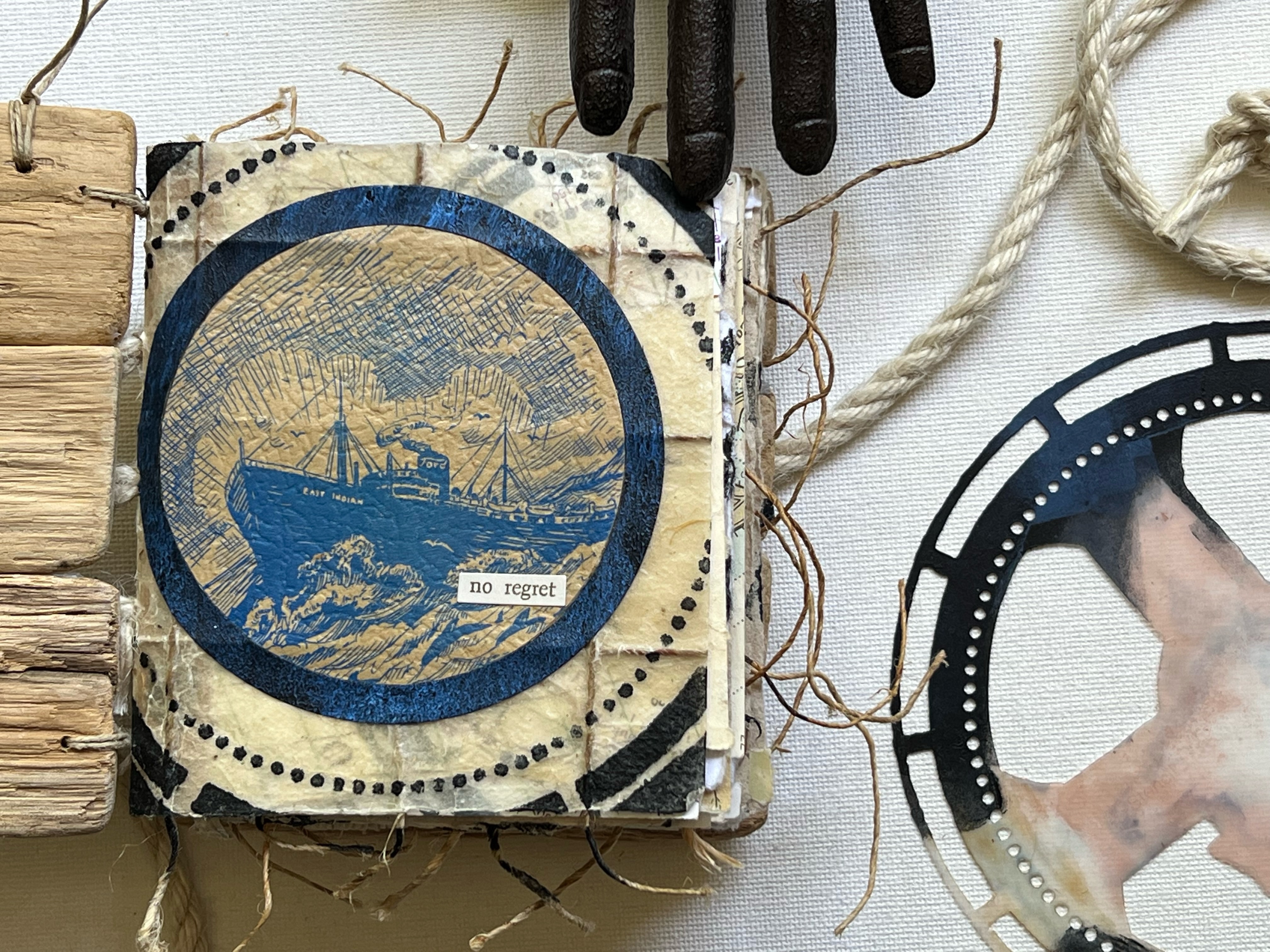
13 Days Adrift tells the story of the survivors of the East Indian, a ship that was sunk by a German U-Boat while out to sea. The book contains illustrations that I knew right away I wanted to incorporate into the new book. After reading the story and considering how I wanted to construct my new book, I wanted to create something that would be as true to the original book as possible. 

The covers of my hand bound book are made from pieces of driftwood. I selected pieces for each cover that were similar in size and that somewhat fit together. The pieces were glued to each other along the edges; a piece of natural twill tape on the inside of each cover serves as additional reinforcement.

The book is comprised of five signatures. Each signature contains pages made of various materials. Marine maps, gel printed original book pages, watercolored illustrations, and handmade papers are collaged, layered, embellished and then sewn together with natural hemp cord. I utilized an exposed binding method that incorporated jute rope, reminiscent of a ship's rigging.

The stencil design I use throughout the book is a circle. Many of the stencils I chose were designed by Seth Apter for StencilGirl®; however, I also used many other designers' stencils, including Mary C. Nasser, Pam Carriker, Traci Bautista, Lauri Mika, and Rae Missigman. 

All of the stencils used are listed below this post. The stencils were used on the gel plate, as well as direct to paper. I used a masking technique for the stencils that contained sections that were not circles. 

When creating my pages, I wanted to achieve a nautical theme. To this effect I must admit I stretched the rules a bit... we were to use only black, white and ANY shade of grey... I chose payne's grey as my primary color, and then added black and white to create different hues. 

The illustrations that I used from the original book were watercolored with payne's grey, white, and black. The main base color used on my gel plate, payne's gray, when layered with white, created a light blueish color. 


After taking the original booklet apart, I removed all of the illustration pages, as well some of the pages that contained phrases I would be cutting out. The remaining pages were gel printed. Within the book I use torn pieces, die cuts and punches of these gel prints.

Many of my favorite pages are displayed within this post; however, I have done a complete flip through of the book on my YouTube channel. You can view the video by clicking the link below. 

I never cease to be amazed by all of the incredible projects that result from these collaborations, each one is completely unique to the artist that created it, even though we all receive the same instructions. I hope that you can take the time to hop over to the StencilGirl® blog and check out all of the different books that were created. (Click here to visit.)

Thank you so much for stopping by, this was a very special project for me. I learned a lot during the process, from paper preservation to color theory and even a new bookbinding technique. Many thanks to Tina Walker for continually inspiring me and challenging me to expand my creativity. 

Wishing you a creative day!  ~Ann 


StencilGirl® stencils used:

ATC Mixup Apter Stencil

ATC Mixup #2 Apter Stencil

Circles Circles Stencil

Color Gradient Swatch Wheel Stencil

Compass Stencil 

Faithful Halo Stencil 

Pilgrimage to the Renaissance Stencil

Spinner Stencil

Techno Insiders Circle Stencil

Urban Insiders Circle Stencil


Thursday, January 20, 2022

finding purpose: unique upcycled bangle bracelets - a StencilGirl® Talk blog post


 Hi everyone, I am excited to be on the StencilGirl® Talk blog today.  I am sharing a tutorial for these unique, upcycled, bangle bracelets, made using my Alphabet Mixup ATC stencils
Like most people, having spent a lot of time in my studio this past year, I noticed there's a lot of space taken up by my stash of collected items. These are the things that I can't seem to possibly throw away, things that have "potential" to be used in alternative ways for projects...things like spent tape rolls. I created five different bangles from tape roll cores, each showcasing a different pattern. I hope you can stop by the StencilGirl® Talk blog to check them all out. 
Perhaps you will be inspired to dig into your stash and create something special. These bracelets would make the perfect gifts, and they can be made using items that you've already got on hand, so they won't cost you anything but time, and in my opinion, any time I can be making art is a good time!


Thanks so much for stopping by today, if you'd like to see my full post on how I created these unique, upcycled, bangle bracelets, be sure to visit the StencilGirl® Talk blog!

 Creatively yours,

Ann

xxx 


StencilGirl stencils:

ATC MixupAlphabet A through I

ATC Mixup Alphabet J through R 

ATC Mixup Alphabet S through Z & 

Monday, October 25, 2021

affirmation deck collaboration for StencilGirl®


Today I am delighted to share the affirmation deck I created for the most recent StencilGirl® collaboration hosted by Tina Walker. I realize it has been a while since I've shared here on the blog; I can't imagine a better project with which to renew my feed. For this collaboration, Tina asked that we "create an Affirmation Deck or Tarot Card Deck in any size, with any mediums, but should highlight StencilGirl® stencils."
As is generally the case when Tina hosts a collaboration, the concept itself sparked my creativity and I began with a swirling of ideas about how my project could come to life. I knew from the start that I wanted to use the Sacred Hearts ATC Mixup stencils by Laurie Mika. The sacred heart being a symbol of love and devotion to all humanity despite the suffering that is endured. 
My faith is an underlying constant in my life regardless of what is going on around me; I wanted my affirmation deck to highlight this. Too often, it is easy to get caught up in the moment and our focus shifts, my hope was that this deck would provide positive insights to push through the most difficult days. 
I began with 4" by 4" mixed media art tiles. One side of each card was layered with PaperArtsy fresco finish paints and collaged with torn pieces of hymn sheet music. More layers of paint and stamping created a base for the sacred heart stencil images. 
Using gold gesso, I sponged a small amount through the stencil onto the background and then set it aside to dry. (Note: be sure to wash the gesso off the stencil before it dries.) The Sacred Heart ATC Mixup stencil contains nine different designs. Using a masking technique, I modified three of the designs to arrive with a set of twelve different cards.
While the gesso was drying, I inked pages of old French text with fired brick and candied apple Distress Ink. Once dry, the pages were spritzed with water to give more depth and a distressed look. I used the stencils as a guide and drew hearts onto the inked pages. The hearts were cut out and incorporated into each design. By using the stencil as a guide, the hearts fit seamlessly into the design. After the hearts were adhered, some of the stencils were placed back onto the image and more gesso was used to replace any portions of the design that may have been covered with the text paper.
Using gold leaf paint, I traced many of the details on each sacred heart design. I filled some areas solid and in others, used the paint to add highlights.
Next I began work on the opposite sides of my cards. The inked, French text papers were used as a base layer for the back side of each card. A fleur-de-lis was stamped randomly onto the backgrounds. I searched  through my stash of religious images and selected twelve different versions of the blessed virgin with child. These images were then cut out and collaged onto the base layer. I used a gold paint pen to add highlights and marks. Using a sea sponge, I added sticky embossing and gold leaf to each background.
Random areas of gold leaf were also added to each card front. In a non-traditional manner, I used a sea sponge to apply embossing ink randomly. I then sprinkled with sticky embossing powder; when the embossing powder was heat set, the leaf was adhered. The extra leaf was rubbed off once the embossing had cooled. 
I compiled a list of positive quotes from various Saints onto a word document and printed it onto gold vellum. Each quote was cut out and attached to the card with a red wax seal. I used the gold paint pen to highlight the raised design within the seal.
Using the remaining scraps of inked French text, I die cut small tattered roses and used them to embellish a few of the sacred heart designs. 
With my affirmation deck complete, I wanted to create a place for safekeeping when the cards were not in use. I had an old fabric bag that held jewelry at some point. I dry brushed the bag with the same paints that were used for the cards. I then selected one of the designs from the Four Sacred Hearts Stencil by Laurie Mika to adorn the bag. Using a fine tip Micron pen, I carefully traced the stencil design onto the fabric. (Note: before beginning any alterations to the fabric bag, cut a piece of cardboard and place it inside to provide a hard surface to work on' the will also prevent any of the paint from seeping through to the back side of the bag.) Using fired brick Distress Paint, I filled in the heart portion of the design and traced the lines of the floral flames extending from the cross. I then used the gold paint pen to color the remaining positions of the design. The paint pen was also used along the drawstring pocket to give a finished edge. 
I look forward to using this affirmation deck to help me in finding peace and positivity among the chaos of these times.
Thank you so much for stopping by the blog today, I really appreciate you taking the time.
If you are interested in seeing any of the other decks from the collaboration, stop over by the StencilGirl® Talk blog today and check out Tina's post. It has links to each of the artists projects and there are some truly incredible decks (tarot as well as affirmation) to see! It's always so interesting to see the different pieces that all begin from the same instructions. This collaboration is definitely worth taking a minute or two of your time to see. Click here to go to the post.

I hope that my deck has inspired you to create something to bring positivity to your days, or perhaps one of the quotes speaks to you and brings you hope.
~ Ann

"All the darkness in the world cannot extinguish the light of a single candle." - St Francis of Assisi


StencilGirl® stencils used:

Sacred Hearts ATC Mixup Stencil (L784) 

Four Sacred Hearts (L782)

Monday, July 26, 2021

creative recipe collaboration for StencilGirl®


It's always a treat to participate in one of Tina Walker's collaborations for StencilGirl®, and the most recent one:       "Cooking with Tina" was no exception. 

The idea behind this collaboration was simple, Tina would create a "creative recipe" that each participant would follow in order to create their own piece of art. Over the course of twelve weeks, each Monday we were given a new ingredient to add to our project, culminating in a completed artwork. We were not given the entire recipe in advance; therefore with each step the piece had to adapt to the new introduction. I decided to complete an art journal spread for this collaboration. 

Week one: prep surface, add two colors of acrylic paint

Using my largest art journal, I added two colors of PaperArtsy Fresco finish paint. I decided that keeping the colors fairly neutral would give me more flexibility for adding the future ingredients.

Week two: add collage material

I added pieces of maps as well as some torn tea/coffee dyed papers along each side of the spread, still keeping with the basic idea of a neutral base to build upon.

Week three: stencil a repeating pattern

At this point, I started getting ideas about the direction I would like my journal spread to take. I envision some sort of architectural approach. In keeping with this idea, I chose the arched aqueduct stencil, and distress ink to create the designs on each of the pages. To maintain balance, I flipped the design along the right hand side. 

Week four: scribble/doodle

Using fluid acrylic paint in a fine liner, I added scribbles along the top and bottom edges of the pages. I also added some lines to accentuate the stencil design and bring it into the foreground.

Week five: opposites

This prompt generated a lot of ideas, ranging from symbols all the way to colors. I settled on using words to express opposites. You will notice the words OPEN and CLOSE. My thoughts behind this choice, since I was still under the assumption this would be some sort of architecture based design, was something along the lines of when one door closes another opens... we will see how that works into the future steps.  

Week six: draw a face

I have to admit, drawing faces is NOT my thing, so I cheated a bit and used a stencil as the basis for my drawn face. I used charcoal with the sweet girl face stencil to draw the basic shape and locations for the features, then went back in with a pencil and attempted to add details. This is THE step that changed the direction of my page. I now had no idea of how this page was going to come together... 

Week seven: add the color red

Adding the color red was not a difficult ingredient to incorporate. I could totally see the sweet girl with a red and white striped shirt, so I repositioned the stencil directly over the face and used a paint pen to color in the striped details on the collar. I also added a red die cut heart "barrette" in her hair.

Week eight: stencil with a Tina Walker stencil

Some of my favorite Tina Walker stencils are from her travels abroad. The cathedral floor stencil was inspired by Jedburgh Abbey from the Scottish borders region. I thought it would be fun to play on my original architecture idea by using this stencil, but in a more whimsical way that would work with the sweet girl that now played a prominent role in my spread. The stencil design became the pattern within butterfly wings that flank the girl. 

Week nine: add ink

Using a water brush, I add distress ink within the butterfly wings, as well as on the sweet girl's cheeks. 

Week ten: add words

Since the art journal spread has detoured from my original thoughts behind the OPEN/CLOSE idea, I used this prompt to add words and create the phrases "close your eyes" and "open your heart". In my mind, this gave the whimsical wings a better tie-in.  

Week eleven: cover something up

This was a no brainer step, I covered up the sweet girl's eyes that I had drawn and were so unhappy with the look of. It also worked well with the "close your eyes" phrase.

Week twelve: add finishing touches

I believe there is still some work to be done on this spread; however, for the sake of completing the collaboration, I "completed" the pages by inking the page edges, adding some bold black marks with the art marks stencil to balance and draw attention to the words, and also added some red thread. As I progressed through this collaboration, the ancient Chinese proverb "an invisible red thread connects those who are destined to meet, regardless of time, place, or circumstance. The thread may stretch or tangle, but it will never break" kept running through my mind, and it was inevitable that it would become integral to the piece.


This was probably one of the most challenging collaborations I have ever done. Since I had no idea what "pieces" would be included, I was never able to get a clear idea for the final result. At times this was frustrating. When I am creating something, even though I don't always know exactly where I am headed, I usually have a general direction and concept. When I tried to keep to an underlying theme, things didn't always work with that idea. Even through all of the detours, I ended up being pleased with the final art journal spread. 


I believe in pushing yourself to try new things and explore beyond your normal boundaries, this is how we experience growth. Thanks so much for taking the time to stop by. I hope that you can visit the some of the other artists that participated in the collaboration, there are so many wonderful projects. You can find Tina's StencilGirl® Talk blog post, including the list of participants here
~Ann 
 x
   

StencilGirl® stencils used:

Arched Aqueduct Stencil (L359) Carolyn Dube

ATC Mixup Missigman Art Marks (L792) Rae Missigman

Cathedral Floor (S822) Tina Walker

Sweet Girl Face small (S859) Jeanne Oliver