Life is full of ups and downs and twists and turns; oftentimes, the unknown can lead to doubts and questioning. For my project today, I created a small affirmation accordion journal. Something little that can make a big impact in turning your thoughts around, just by opening it. A friend of mine had sent me a stamped saying a while back that really struck a chord with me. I have had it on the corner of my work table so that I could see it every time I went in to create. It is amazing how such a small reminder can make a difference. This was the inspiration behind my affirmation accordion.
 Sometimes journals can be oversized and intimidating, I thought for this piece I would work with Gypsy Soul laser Cuts ATC sized ticket journals. These are a lot of fun to work with and their size is perfect to pop into a pocket or bag and carry with you. I begin with two sets of the ATC ticket journal, knowing that I will be adhering the first and last "tickets" onto my own covers, I want the inside to have more interior pages than the one piece will provide. Each piece contains a strip of five tickets.


Before adhering any of the paper pieces, I attach strips of linen binding tape to each external (mountain) fold. This will reinforce the folded edge, which will help prevent tearing. The strips are inked with distress ink so they blend into the design. All of the internal (valley) folds are covered with pieces of coordinating design tape. Since these are the inside edges of the reinforced folds, it is really more for decorative purpose. Most often when I begin to assemble the pieces, I tend to re-arrange a bit, since I have some extra pieces, it is easy to make adjustments to backgrounds. I attach the papers to the ticket bases with double sided adhesive tape. Some of the collage pieces are attached with collage medium. The front cover is attached along with all of the interior pieces; I wait to attach the back cover until the inside pages are complete. This way the ribbon does not get in the way or covered with glue. I color the seam binding ribbon with distress oxide inks to coordinate.


The cover contains a quote token that has been colored with alcohol inks and edged with burnt copper leaves embossing powder. Distress crayon is rubbed into the text impressions.

The collage paper covered ticket is attached to the inside of the cover and a few metallic quote stickers are added. The adjacent page is a layering of die cut papers, the central portion cut from worn wallpaper and adorned with a few simple stitches and a rub-on "wish".

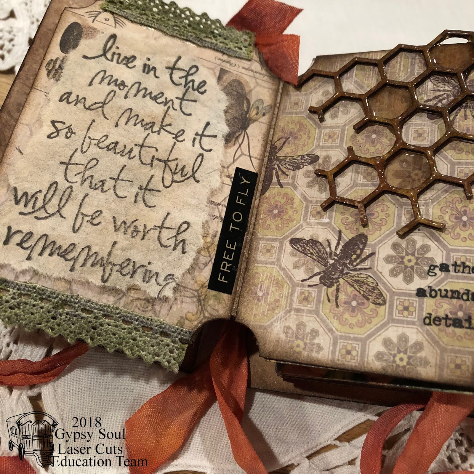
Next are a couple of my favorite pages, the inspirational piece (the stamped sentiment on a tea bag) is flanked by two lengths of inked lace trim and another metallic quote sticker. The honeycomb piece is coated with vintage beeswax embossing powder and attached to the stamped paper background. Some of the cells are filled with beeswax embossing powder and melted, remnant rub words complete this page.

Flowers are die cut from text pages and colored with distress ink, then coated with vintage beeswax embossing powder. These are tied together into a bouquet with craft thread and attached to the center of the framed ticket. On the right, a reminder to be true to yourself. It is not always easy to rise above the general flow, but it is what makes each of us important as individuals. The background paper is inked and stenciled. Golden highlights are added around the quote stickers. A hinged ticket reveals the words "be true."

Always seek wisdom, it helps us to learn and grow. The word SEEK is die cut from the base paper revealing colored paper below. Another piece of beeswax-embossed honeycomb contains open cells which include positive thoughts. The embossed bee is from the GSLC set. Another collage paper covered ticket is attached inside the back cover and contains one of my favorite sayings.

Turning the accordion over to reveal the back sides of the interior pages:

A single stem from the bouquet is attached to the ticket with the words "listen to your heart."
A framed piece of worn wallpaper displays a shadowed "love" die cut and a small ticket with a mirrored heart and clippings sticker. When we let our hearts guide us, we are destined for good.

One of the additional collage paper covered tickets is located in the center of the accordion, with a metallic quote sticker. Some craft thread with glass beads creates a page holder. A collage frame leaves some open space to include future thoughts.

Four brads secure the band which holds tickets made of the various papers used to create the pages. These will be used to include positive thoughts and memorable sayings or events. The last ticket page is simply a beautiful layered composition.


I really enjoyed creating this affirmation accordion with the Gypsy Soul Laser Cuts ATC ticket journal pieces. I hope that you are inspired to create something beautiful. Thank you so much for taking the time to visit today.
A little kindness can make a world of difference.
~Ann
I am entering this project in:

Mini Album Makers Challenge - September 2018
Simon Says Stamp Monday Challenge - Stamp It On
(my inspiration piece is a stamped image and I have stamped bees throughout the accordion)
Simon Says Stamp Wednesday Challenge - Anything Goes
Supplies used:
Gypsy Soul Laser Cuts: ATC ticket journal, honeycomb and bees small
Distress collage medium: matte, vintage
Distress ink: black soot, peeled paint, walnut stain, worn lipstick
Distress Oxide ink: aged mahogany, tattered rose, wild honey, worn lipstick
Emerald Creek allure embossing powder: burnt copper leaves
Seth Apter/Emerald Creek vintage beeswax baked texture embossing powder
Tim Holtz Eclectic Elements craft thread
Tim Holtz Ideaology:
clippings stickers, collage paper - floral, crinkle ribbon, fasteners, lace, quotations metallic stickers,
quote token, remnant rubs,
Tim Holtz/Sizzix 3D Texture Fade: lumber
Tim Holtz/Sizzix Movers and Shapers: ticket
Tim Holtz/Sizzix Thinlits:
celebration words, flower jar, gift tags, stacked label, traveler words
Tim Holtz/Stampers Anonymous mini stencil THMS075