Hi everyone, today I am excited to share a fabric book I created for the most recent StencilGirl® collaboration hosted by Tina Walker. The concept behind this challenge was fairly simple: each artist would:"Create a fabric journal/book that uses StencilGirl® number stencils. It is preferred that the stencils are the highlight of your book, but if you also use them to create wonderful backgrounds, that is a-ok! The preference is that your stencil use is limited to numbers only. Feel free to use fabric paint, sprays, acrylic paint, markers, etc. Your journal/book can be any number of pages - no limit or min."
When I began to consider this project, I could not stop thinking about embroidering the numbers as focal points on the fabric pages...of course, I've never embroidered a day in my life... which seems to be par for the course when I take on one of Tina's SG challenges, yet, I always appreciate stepping out of my comfort zone. I find myself pushing beyond my "normal" creative boundaries and I am never disappointed in what I can achieve.
My project, "count to ten" is a handmade fabric book. The intention behind this creation was that, so often there are things happening around us or in our day to day that seem overwhelming or upsetting; stepping back and taking a moment to "count to ten" can make a world of difference. Whether those ten counts are simply deep breaths, or ten positive thoughts or maybe even counting ten personal blessings, they can be just what we need to give us a different perspective.
Each page background consists of a painted number stencil repeated randomly. Each page also contains a pocket featuring the same stenciled number, in a larger size, that has been hand embroidered. An integrated bookmark, with an attached Milagro, can be moved from page to page and inserted into the pocket as one counts.
When creating each of the pages, I randomly stenciled a number in various directions to create a background pattern. The Vintage Typewriter Stencil (L591) has two different sizes of numbers. For the backgrounds I used the smaller sized numbers. I covered each page with stenciled numbers using acrylic paint and allowed to dry before moving onto the next page.
The next step was the most time consuming. Since I wanted the book to be somewhat monotone, I decided to dye some thin cotton yarn with Paynes grey ink. I loved the variation of color that I achieved by doing this. Next, using a piece of lightweight muslin as a base, I traced the outline of a larger sized number with an extra fine Micron pen. I hooped the piece and then filled the outline with stitches. I did this same process for each of the ten large numbers.
The stitched pieces were cut into rectangles and then fused onto a larger piece of indigo handmade paper. I fused each embroidered piece along three edges its respective background page creating a pocket. Since the pockets may be used to hold things, I reinforced each of the four corners using French knots.
The cover was made using a recycled piece of denim. After cutting the denim to size, I sewed the signature into the cover. Next, I stamped "one to ten" with a Payne's grey acrylic paint mixture. There are ten Milagros attached to the bottom edge of the book with French knots.
There are a number of artists that created beautiful projects for this challenge. Tina is sharing the inspiration behind the challenge as well as her amazing project and links to each of the participating artists on the StencilGirl Talk blog today.
You can find pictures, details and links to each specific artists creation on the StencilGirl® Talk Blog here.
I hope you can take a minute to hop over and check it out.
I loved making this book and maybe it has inspired you to make one something similar.
Thanks so much for stopping by today, I truly appreciate it.
"Fate is the cards you were given when you were born. Destiny is what you do with them."
- Gina E. Jones
The StencilGirl® collaborations that Tina Walker dreams up are always an adventure! They challenge me to try new techniques, incorporate stencils into my artwork in unusual ways, and light a creative spark within me. The altered playing card collaboration was no different. The challenge delivered was simple: "alter a complete deck of playing cards. It can be as simple as collaging stenciled paper on the back sides of each card or as elaborate as altering both sides of each card with doodles, drawings, and (of course) stenciled parts using StencilGirl® stencils."
"we cannot change the cards we are dealt, just how we play the game"
-Randy Paulsch
The first order of business was to find a deck of cards to alter. My initial creative musings over how I would complete this challenge involved collaging stenciled papers to the deck in ways that would allow the cards to still be usable for playing games. With no intention to completely cover the cards, I wanted a deck that would provide an interesting base layer to build off of. I chose a deck of stylized Bicycle playing cards called Bourbon. I loved the coloration and thought that altering the face cards (or in particular their clothing) would be akin to creating paper dolls... In my eagerness to get started, I seem to have disregarded the actual size of a deck of cards. When the deck arrived, I realized that it would be nearly impossible to showcase stenciling in the areas that would be "clothing." I did however, love the coloration and retro vibe that the deck seemed to have. I needed to take a step back and reassess my original idea.
"Life consists not in holding good cards, but in playing those you hold well."
-Josh Billings
Each new idea that popped up was centered around the different suits in the deck, which would be a dead giveaway for anyone that would ever use this deck for playing a card game. This opened my mind to creating something altogether different from my altered deck. With the restriction of maintaining the integrity the card values removed, the possibilities were endless.
"Destiny plays its cards in a way that no one can comprehend."
-Anurag Shourie
I decided that I would create an interactive book with my deck. One that would contain inspiring quotes based on card playing, and that would showcase the style that drew me to this particular deck in the first place. With a plan in place, I searched through my ever growing stash of StencilGirl® stencils and chose a set that I felt would enhance the retro vibe of the deck. The Retro Chic stencil set by Lizzie Mayne contains five distinct designs, one larger and four smaller scaled stencils. For this project, I used three of the smaller scaled designs.
"The key to success is playing the hand you were dealt like it was the hand you wanted."
-Kaitlyn Walsh
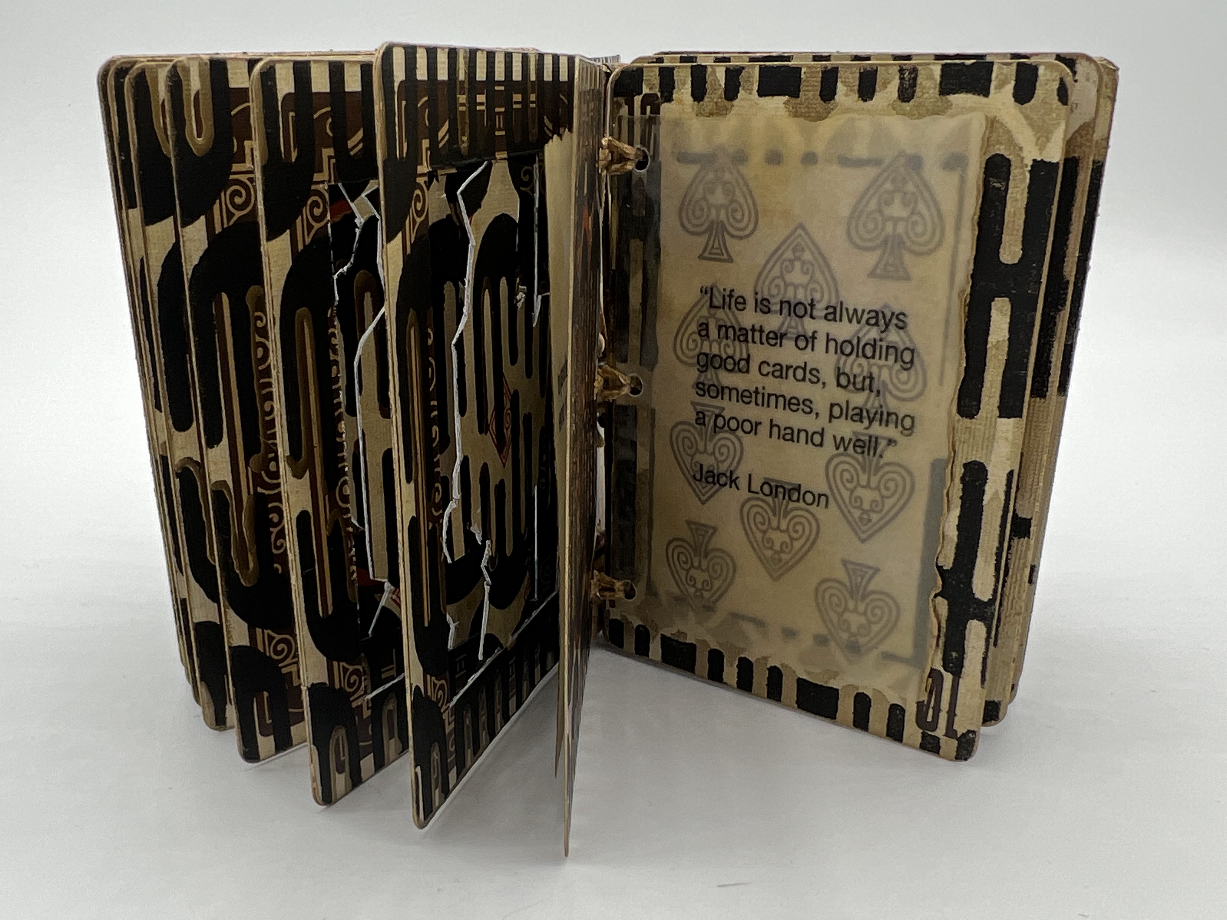
Within my book, each of the face cards has a central, rectangular portion removed. A matching rectangular section was removed from a number card of the same suit. A piece of clear fishing line is sandwiched between the two rectangles, which extends beyond the edges at both the top (crown) and bottom (vestments). The rectangles are glued together and then allowed to dry completely flat. I fussy cut each "royal" person from their respective rectangle. Since I intend to leave the face side of each royal unaltered, I stencil the "face side" of the outer frame pieces prior to assembling the spinning sections.
"One should always play fairly when one has the winning cards."
-Oscar Wilde
The "face side" frames contain two layers of stenciling, first a layer of Golden Bronze iridescent acrylic paint is lightly stenciled through one of the designs. Once this layer has dried, a second layer of stenciling (through one of the other designs in the set) is added using black gesso. The easiest way to accomplish a uniform design on a large number of cards is to create a "jig." I use a masking tape guide to align each card in the same position. Once I determine the optimal stencil placement, the stencil is taped down at the top creating a hinge so that I can lift it between each card. While everything is set up, I also stencil the "face side" of each of my number cards while covering the central area with a mask. I stencil all of the cards with the first layer before changing the "jig"to accommodate the second layer of stenciling. The stenciling on the back sides of all cards is completed once the spinning pieces are in place. This allows the stenciling to line up when an open page abuts one that is solid.
"Life is not always a matter of holding good cards, but sometimes, playing a poor hand well."
-Jack London
To assemble the framed spinners, I locate the frames that match each royal person. Then, placing the fussy cut piece in the center opening, the extended ends of fishing line are sandwiched between the two frames, which are then adhered together. This can be done using double sided tape or glue, whichever you prefer. I used glue; however, using tape would be just as effective and also not require additional drying time. To create a uniform thickness for the book pages, you can also double up the number cards. When all of the page assembly is complete, it is time to stencil the reverse sides.
"Its not the cards you have that make you a winner or a loser."
-Doyle Brunson
The easiest and most efficient way to create a uniform appearance is to use the"jig" method described above. The reverse sides have one layer of stenciling, done with black gesso. When all of the stenciling is dry, I add gold details using a fine liner filled with acrylic paint. The detailed cards are set aside to dry overnight.
The number cards in my book each contain an inspirational quote based on card playing. Each quote is printed on an inked vellum rectangle then attached to the card.
I cut chipboard to create the front and back book covers, these are covered with coordinating handmade paper. Stenciled cards are attached to the front and back.
Following a YouTube video by Lisbeth Degn, I utilized a slip Knot binding technique. This type of binding works perfectly for individual pages. Each of my pages have three holes along the leading edge where the waxed cord knots them together.
Click below for a flip through video of my altered playing card book.
One of the best parts of the StencilGirl® collaborations is being able to see the other ways that artists have interpreted the challenge. Check out all of the awesome altered playing card projects that were created foe this challenge in Tina's blog post on StencilGirl Talk.
Thanks so much for stopping by the blog today to check out my project, I truly appreciate you taking the time. I hope that maybe you will be inspired to create something today.
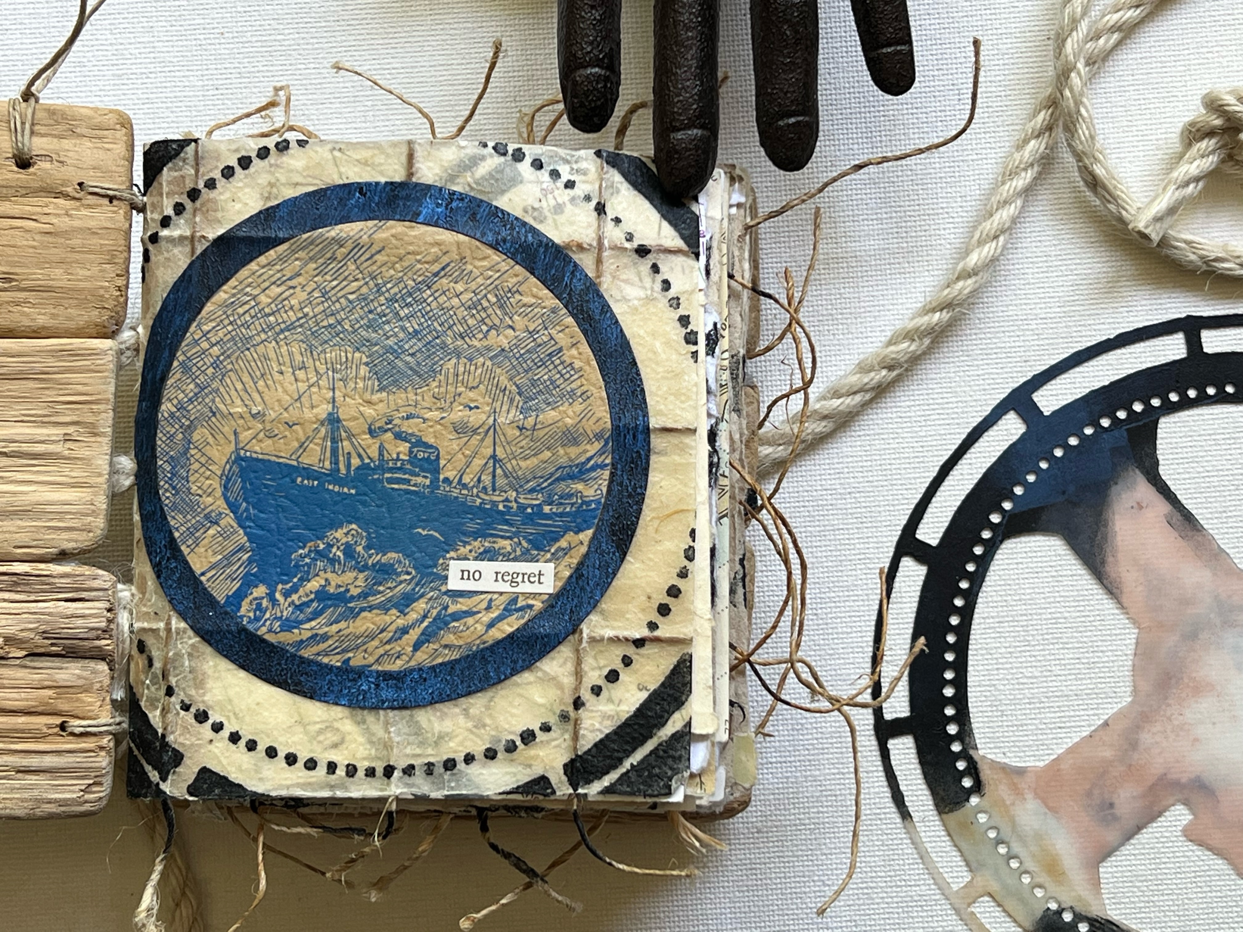
Hello everyone, today I am excited share a handmade book I created for the most recent StencilGirl® collaboration hosted by Tina Walker. The concept behind this challenge was fairly simple: each artist would receive a vintage 13 Days Adrift booklet. You would then deconstruct and reconstruct a book/journal with a technique/style of your choosing. You were welcome to use the original book however you chose, as long as it was incorporated into your new book.
The rules were as follows: pick one shape of stencils to be used throughout your book, the book pages must be created in black and white (and all shades of grey), you can use any mediums (as long as they are black white or any shade of grey), and you can use any theme, structure, or story.
13 Days Adrift tells the story of the survivors of the East Indian, a ship that was sunk by a German U-Boat while out to sea. The book contains illustrations that I knew right away I wanted to incorporate into the new book. After reading the story and considering how I wanted to construct my new book, I wanted to create something that would be as true to the original book as possible.
The covers of my hand bound book are made from pieces of driftwood. I selected pieces for each cover that were similar in size and that somewhat fit together. The pieces were glued to each other along the edges; a piece of natural twill tape on the inside of each cover serves as additional reinforcement.
The book is comprised of five signatures. Each signature contains pages made of various materials. Marine maps, gel printed original book pages, watercolored illustrations, and handmade papers are collaged, layered, embellished and then sewn together with natural hemp cord. I utilized an exposed binding method that incorporated jute rope, reminiscent of a ship's rigging.
The stencil design I use throughout the book is a circle. Many of the stencils I chose were designed by Seth Apter for StencilGirl®; however, I also used many other designers' stencils, including Mary C. Nasser, Pam Carriker, Traci Bautista, Lauri Mika, and Rae Missigman.
All of the stencils used are listed below this post. The stencils were used on the gel plate, as well as direct to paper. I used a masking technique for the stencils that contained sections that were not circles.
When creating my pages, I wanted to achieve a nautical theme. To this effect I must admit I stretched the rules a bit... we were to use only black, white and ANY shade of grey... I chose payne's grey as my primary color, and then added black and white to create different hues.
The illustrations that I used from the original book were watercolored with payne's grey, white, and black. The main base color used on my gel plate, payne's gray, when layered with white, created a light blueish color.
After taking the original booklet apart, I removed all of the illustration pages, as well some of the pages that contained phrases I would be cutting out. The remaining pages were gel printed. Within the book I use torn pieces, die cuts and punches of these gel prints.
Many of my favorite pages are displayed within this post; however, I have done a complete flip through of the book on my YouTube channel. You can view the video by clicking the link below.
I never cease to be amazed by all of the incredible projects that result from these collaborations, each one is completely unique to the artist that created it, even though we all receive the same instructions. I hope that you can take the time to hop over to the StencilGirl® blog and check out all of the different books that were created. (Click here to visit.)
Thank you so much for stopping by, this was a very special project for me. I learned a lot during the process, from paper preservation to color theory and even a new bookbinding technique. Many thanks to Tina Walker for continually inspiring me and challenging me to expand my creativity.
Today I am delighted to share the affirmation deck I created for the most recent StencilGirl® collaboration hosted by Tina Walker. I realize it has been a while since I've shared here on the blog; I can't imagine a better project with which to renew my feed. For this collaboration, Tina asked that we "create an Affirmation Deck or Tarot Card Deck in any size, with any mediums, but should highlight StencilGirl® stencils."
As is generally the case when Tina hosts a collaboration, the concept itself sparked my creativity and I began with a swirling of ideas about how my project could come to life. I knew from the start that I wanted to use the Sacred Hearts ATC Mixup stencils by Laurie Mika. The sacred heart being a symbol of love and devotion to all humanity despite the suffering that is endured.
My faith is an underlying constant in my life regardless of what is going on around me; I wanted my affirmation deck to highlight this. Too often, it is easy to get caught up in the moment and our focus shifts, my hope was that this deck would provide positive insights to push through the most difficult days.
I began with 4" by 4" mixed media art tiles. One side of each card was layered with PaperArtsy fresco finish paints and collaged with torn pieces of hymn sheet music. More layers of paint and stamping created a base for the sacred heart stencil images.
Using gold gesso, I sponged a small amount through the stencil onto the background and then set it aside to dry. (Note: be sure to wash the gesso off the stencil before it dries.) The Sacred Heart ATC Mixup stencil contains nine different designs. Using a masking technique, I modified three of the designs to arrive with a set of twelve different cards.
While the gesso was drying, I inked pages of old French text with fired brick and candied apple Distress Ink. Once dry, the pages were spritzed with water to give more depth and a distressed look. I used the stencils as a guide and drew hearts onto the inked pages. The hearts were cut out and incorporated into each design. By using the stencil as a guide, the hearts fit seamlessly into the design. After the hearts were adhered, some of the stencils were placed back onto the image and more gesso was used to replace any portions of the design that may have been covered with the text paper.
Using gold leaf paint, I traced many of the details on each sacred heart design. I filled some areas solid and in others, used the paint to add highlights.
Next I began work on the opposite sides of my cards. The inked, French text papers were used as a base layer for the back side of each card. A fleur-de-lis was stamped randomly onto the backgrounds. I searched through my stash of religious images and selected twelve different versions of the blessed virgin with child. These images were then cut out and collaged onto the base layer. I used a gold paint pen to add highlights and marks. Using a sea sponge, I added sticky embossing and gold leaf to each background.
Random areas of gold leaf were also added to each card front. In a non-traditional manner, I used a sea sponge to apply embossing ink randomly. I then sprinkled with sticky embossing powder; when the embossing powder was heat set, the leaf was adhered. The extra leaf was rubbed off once the embossing had cooled.
I compiled a list of positive quotes from various Saints onto a word document and printed it onto gold vellum. Each quote was cut out and attached to the card with a red wax seal. I used the gold paint pen to highlight the raised design within the seal.
Using the remaining scraps of inked French text, I die cut small tattered roses and used them to embellish a few of the sacred heart designs.
With my affirmation deck complete, I wanted to create a place for safekeeping when the cards were not in use. I had an old fabric bag that held jewelry at some point. I dry brushed the bag with the same paints that were used for the cards. I then selected one of the designs from the Four Sacred Hearts Stencil by Laurie Mika to adorn the bag. Using a fine tip Micron pen, I carefully traced the stencil design onto the fabric. (Note: before beginning any alterations to the fabric bag, cut a piece of cardboard and place it inside to provide a hard surface to work on' the will also prevent any of the paint from seeping through to the back side of the bag.) Using fired brick Distress Paint, I filled in the heart portion of the design and traced the lines of the floral flames extending from the cross. I then used the gold paint pen to color the remaining positions of the design. The paint pen was also used along the drawstring pocket to give a finished edge.
I look forward to using this affirmation deck to help me in finding peace and positivity among the chaos of these times.
Thank you so much for stopping by the blog today, I really appreciate you taking the time.
If you are interested in seeing any of the other decks from the collaboration, stop over by the StencilGirl® Talk blog today and check out Tina's post. It has links to each of the artists projects and there are some truly incredible decks (tarot as well as affirmation) to see! It's always so interesting to see the different pieces that all begin from the same instructions. This collaboration is definitely worth taking a minute or two of your time to see. Click here to go to the post.
I hope that my deck has inspired you to create something to bring positivity to your days, or perhaps one of the quotes speaks to you and brings you hope.
~ Ann
"All the darkness in the world cannot extinguish the light of a single candle." - St Francis of Assisi
It's always a treat to participate in one of Tina Walker's collaborations for StencilGirl®, and the most recent one: "Cooking with Tina" was no exception.
The idea behind this collaboration was simple, Tina would create a "creative recipe" that each participant would follow in order to create their own piece of art. Over the course of twelve weeks, each Monday we were given a new ingredient to add to our project, culminating in a completed artwork. We were not given the entire recipe in advance; therefore with each step the piece had to adapt to the new introduction. I decided to complete an art journal spread for this collaboration.
Week one: prep surface, add two colors of acrylic paint
Using my largest art journal, I added two colors of PaperArtsy Fresco finish paint. I decided that keeping the colors fairly neutral would give me more flexibility for adding the future ingredients.
Week two: add collage material
I added pieces of maps as well as some torn tea/coffee dyed papers along each side of the spread, still keeping with the basic idea of a neutral base to build upon.
Week three: stencil a repeating pattern
At this point, I started getting ideas about the direction I would like my journal spread to take. I envision some sort of architectural approach. In keeping with this idea, I chose the arched aqueduct stencil, and distress ink to create the designs on each of the pages. To maintain balance, I flipped the design along the right hand side.
Week four: scribble/doodle
Using fluid acrylic paint in a fine liner, I added scribbles along the top and bottom edges of the pages. I also added some lines to accentuate the stencil design and bring it into the foreground.
Week five: opposites
This prompt generated a lot of ideas, ranging from symbols all the way to colors. I settled on using words to express opposites. You will notice the words OPEN and CLOSE. My thoughts behind this choice, since I was still under the assumption this would be some sort of architecture based design, was something along the lines of when one door closes another opens... we will see how that works into the future steps.
Week six: draw a face
I have to admit, drawing faces is NOT my thing, so I cheated a bit and used a stencil as the basis for my drawn face. I used charcoal with the sweet girl face stencil to draw the basic shape and locations for the features, then went back in with a pencil and attempted to add details. This is THE step that changed the direction of my page. I now had no idea of how this page was going to come together...
Week seven: add the color red
Adding the color red was not a difficult ingredient to incorporate. I could totally see the sweet girl with a red and white striped shirt, so I repositioned the stencil directly over the face and used a paint pen to color in the striped details on the collar. I also added a red die cut heart "barrette" in her hair.
Week eight: stencil with a Tina Walker stencil
Some of my favorite Tina Walker stencils are from her travels abroad. The cathedral floor stencil was inspired by Jedburgh Abbey from the Scottish borders region. I thought it would be fun to play on my original architecture idea by using this stencil, but in a more whimsical way that would work with the sweet girl that now played a prominent role in my spread. The stencil design became the pattern within butterfly wings that flank the girl.
Week nine: add ink
Using a water brush, I add distress ink within the butterfly wings, as well as on the sweet girl's cheeks.
Week ten: add words
Since the art journal spread has detoured from my original thoughts behind the OPEN/CLOSE idea, I used this prompt to add words and create the phrases "close your eyes" and "open your heart". In my mind, this gave the whimsical wings a better tie-in.
Week eleven: cover something up
This was a no brainer step, I covered up the sweet girl's eyes that I had drawn and were so unhappy with the look of. It also worked well with the "close your eyes" phrase.
Week twelve: add finishing touches
I believe there is still some work to be done on this spread; however, for the sake of completing the collaboration, I "completed" the pages by inking the page edges, adding some bold black marks with the art marks stencil to balance and draw attention to the words, and also added some red thread. As I progressed through this collaboration, the ancient Chinese proverb "an invisible red thread connects those who are destined to meet, regardless of time, place, or circumstance. The thread may stretch or tangle, but it will never break" kept running through my mind, and it was inevitable that it would become integral to the piece.
This was probably one of the most challenging collaborations I have ever done. Since I had no idea what "pieces" would be included, I was never able to get a clear idea for the final result. At times this was frustrating. When I am creating something, even though I don't always know exactly where I am headed, I usually have a general direction and concept. When I tried to keep to an underlying theme, things didn't always work with that idea. Even through all of the detours, I ended up being pleased with the final art journal spread.
I believe in pushing yourself to try new things and explore beyond your normal boundaries, this is how we experience growth. Thanks so much for taking the time to stop by. I hope that you can visit the some of the other artists that participated in the collaboration, there are so many wonderful projects. You can find Tina's StencilGirl® Talk blog post, including the list of participants here.