Showing posts with label baked texture. Show all posts

Thursday, October 10, 2019

grateful

If there is one month I associate with the fall season, it has to be October. 
Where I live, this month offers witness to the glory of mother nature by means of an autumnal show of stunning color. We watch as the leaves turn gorgeous shades of golden yellow, bronze, and red, before they are shed in preparation for a winter's lull. As I appreciate all the wonder that is presented to me, it gives me a wonderful opportunity to really give thanks for all that I have. This is the inspiration behind my gratitude journal for the Emerald Creek Dares Challenge this month.
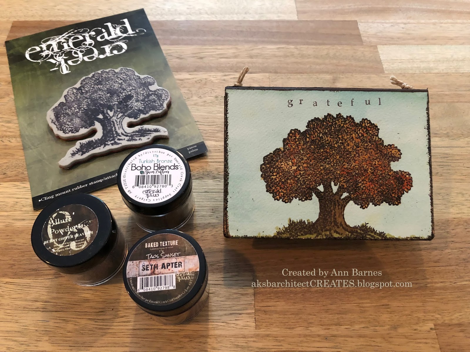
I begin by stamping the Emerald Creek Oak Tree Stamp with Archival ink onto watercolor paper that has been colored with a wash of Distress ink. Using a stamping platform, it is easy to re-stamp the upper portion of the tree with VersaMark embossing ink. 
I sprinkle embossing powders over the leafed section of the tree in a random pattern. I use Turkish Bronze, Taos Sunset, and Burnt Copper Leaves powders; each of which is absolutely beautiful on its own; however, I thought by using a blend of powders, I could achieve the variation that is so typically seen in nature. Once the embossing has cooled, I color the stamped and embossed image of the tree with distress inks. I also stamp the word "grateful" along the top edge. This panel becomes the cover of my gratitude journal. Using my Xyron creative station lite, I add adhesive to the back of the panel, and attach it to the notebook die cut. 
More of the inked watercolor paper is used to create the interior panels for the journal. These pieces are cut to size and then stamped with decaying leaf images with embossing ink. These leaves are coated with Burnt Copper Leaves embossing powder and heat set. When the embossing has cooled, these panels are attached to the interior of the book. 
I run my embossing pad along the sides and bottom of the front cover then add more of the Burnt Copper Leaves Embossing powder and heat set. This creates a wonderful finished edge that coordinates with both the inside and out. 
The back of the gratitude journal is covered in a faux wood paper created using a 3D embossing folder and inks to create a realistic looking (and feeling) panel. Another section of this faux wood runs along the top spine of the journal. 
Paper twine is strung between two eyelets to secure the signature inside. I want the signatures to be removable so that each year I can complete a new month of entries and keep the old ones to look over and know just how filled with blessings my life is.    
One thing I know I am grateful for is all of you, my followers, I appreciate you taking the time to stop by the blog and for all of your wonderful comments.
I hope that you are able to find time this fall to soak in some of the beauty that nature has to offer.
If you have the opportunity to create something fall/Halloween inspired, please consider joining this month's Emerald Creek Dares Challenge.
Thank you so much for stopping by today. 
~Ann
 xxx


I am entering this into the following challenges:


supplies used: 
1/8" eyelets
chipboard
Crop-a-dile tool
Distress Archival ink: ground expresso
Distress inks: 
broken china, brushed corduroy, forest moss, ground expresso, rusty hinge,
 vintage photo, walnut stain,  
Eileen Hull/Sizzix notebook die
Emerald Creek Art Stamps:
Emerald Creek Embossing powders:
paper twine
Tim Holtz/Sizzix 3D Texture Fade lumber
Tim Holtz/Stampers Anonymous leaf prints stamps (CMS273)
Tim Holtz stamping platform
VersMark embossing ink
watercolor paper
Xyron Creative Station Lite

Thursday, September 12, 2019

art and soul

Hi everyone, September means back to school; 
the Emerald Creek Dares Challenge is embracing this event with the theme
 "Be True to your School"
 I realize that many different types of students all have varying opinions on what will be their "best class" this year. I was always partial to math class; however, one of my other favorites tended to be art. Using this as inspiration for my September project, I have created a panel titled "art and soul."
I begin with four square panels of Bristol board.
I then select different pieces of vintage papers from my stash that represent different educational subjects. I tear these papers into strips and pieces, then layer them onto the four panels using collage medium.
When the collage medium has dried, I add a layer of color with Paper Artsy fresco paint (butter). I also add layers of distress ink (fossilized amber and wild honey). When the inks are dry I stamp additional images onto the panels with black soot Archival ink and set aside to dry completely. 
Next, I coat each panel with a layer of embossing ink then cover with a layer of Vintage Beeswax Baked Texture. This layer is heat set and then allowed to cool. When cool, an additional layer of embossing ink is added, then once again, covered with Vintage Beeswax embossing powder and heated. I add an additional layer of stamped images with Archival ink between coats of beeswax embossing to create added depth. 
I continue adding the layers of embossing until I am satisfied with the appearance. One of my favorite aspects of the Baked Texture Vintage Beeswax is the rich warm colors that emerge as the layers are built, these layers and colors are further enhanced by the colors that you have added beneath.
Using Staz-On pigment ink (black) I stamp my final images onto the topmost layer of embossing. The incredible color wheel image fit perfectly with my theme and then I added the words "Art" and "soul" onto separate panels. The four panels were then attached to a square base panel that was painted with flat black paint.
I really love the way that this piece turned out, looking at all the different layers and color gradients within each panel is truly satisfying.
The vintage beeswax is an amazing embossing powder. It is now available in a larger jar, which I am thrilled about. I truly believe this powder is best when applied in multiple layers and the larger jar ensures you won't run out in the middle of a project. It is a really great value as well.
Thank you so much for taking the time to stop by and learn about my piece.
Maybe it even inspired you to join the Emerald Creek challenge this month.
 Here is a link to enter if you dare!
~Ann

supplies:
Distress collage medium:matte
Impression Obsession / Seth Apter stamps:
color chart (H18088), primitives (3193-LG)
Paper Artsy fresco paints: butter
Ranger / Tim Holtz Distress Archival Ink: black soot
Stampers Anonymous / Tim Holtz stamps:
brush collection (P2-2111), mini worn text (CMS156) 
Staz-On Pigment Ink: black
VersaMark Embossing Ink


Thursday, June 13, 2019

liberty

Hi everyone, this month the Emerald Creek Dares Challenge is an "anything goes" theme based on the summer, and the song Summer In The City. Today I am on the blog, sharing "liberty."
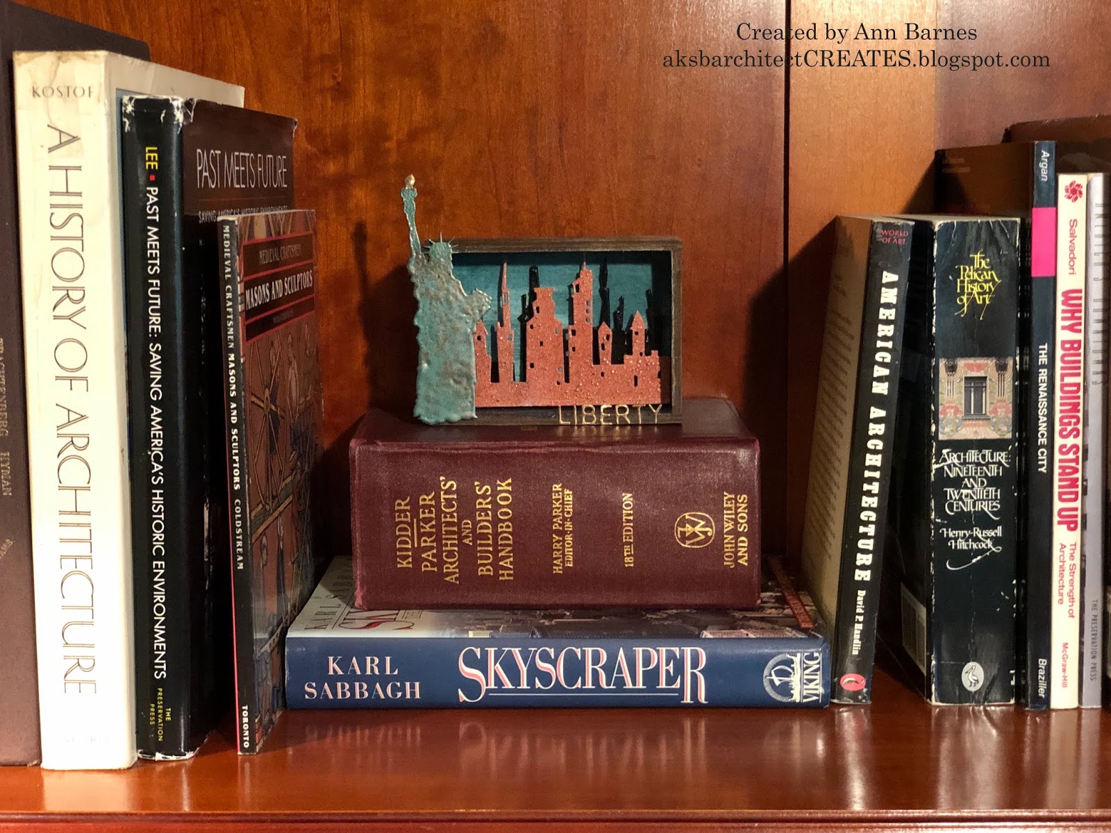
I wanted to make something directly related to the inspiration "Summer in the City." I have created a small vignette of New York City, a wonderful place to visit any time of year, and most especially, the Statue of Liberty, which is an incredible summer tour destination.
I begin with a wooden vignette box. The inside is covered with a layer of white gesso and allowed to dry. I know that I will be using the translucent Baked Velvet powder in Agean Sea to create the sky, and want a clean base to best display the color. I begin with one layer of embossing powder on the back panel as well as the interior top and sides. The powder is heat set and then cooled. Once cool, I brush on random areas of embossing ink and add another coat of Agean Sea powder. These areas are heat set, manifesting a deeper color, adding interest and also perhaps representing wispy clouds.
The interior base of the vignette box is coated with embossing ink and covered with Deep Sea Baked Texture embossing powder. This powder is also translucent but a much darker shade of blue/green. I thought this would be perfect for the waters that surround Ellis Island and NYC.
Once the backgrounds are complete, I begin work on the city skylines. I know I want to have at least a couple rows of buildings to give the vignette depth. Using pieces of skyline die-cut, I determine which sections will be in the foreground and which will set into the background. The pieces are cut to fit inside the vignette box. The background skyline is coated with VersaMark embossing ink; covered with Seth Apter's Eclipse Baked Velvet embossing powder, then heat set.
The foreground skyline is covered with Seth Apter's Chunky Rust Baked Texture embossing powder and heat set. Once cool, the pieces are set into the vignette box. I use a piece of wood dowel along the bottom edge of the first skyline to create a gap behind the piece. The second skyline also has a wood spacer to set it a distance in front of the first.
I like the shadow lines this creates as well as providing plenty of visual depth.
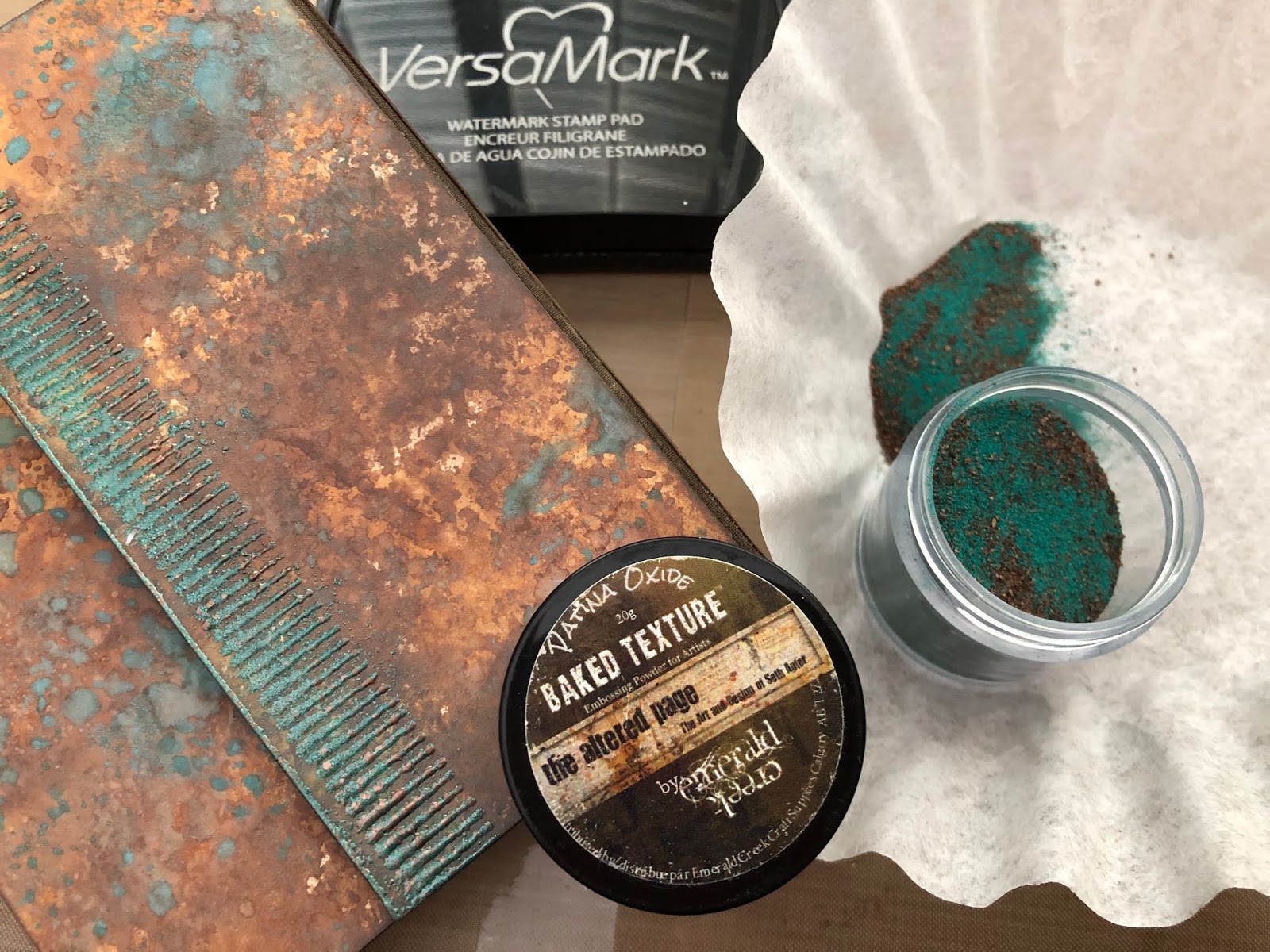
The Statue of Liberty chipboard shape is coated with embossing ink and covered with Patina Oxide Baked Texture, one of my favorites of Seth Apter's original release. The flame is first covered with Mirror Platinum then a layer of Ancient Amber Baked Texture is added to give the flame an authentic look. Lady Liberty is secured to the edge of the vignette box with a strong adhesive and set aside to cure.
The label letters forming the title "LIBERTY" are die-cut from Metallic Kraft Stock and adhered to the bottom rail of the vignette box with collage medium. I think this will be a fun piece to display and evoke memories of a wonderful experience.
I hope that you are inspired to play along with the Emerald Creek Dares challenge this month, we'd love to see what you've been creating with a summer theme. Be sure to add your link, if you dare.  When posting on any of the social media sites, use the hashteg #ECJUNE2019.
Thanks so much for stopping by today.
~Ann  


Project Supply List

Emerald Creek Embossing Powders:
Baked Texture: Ancient Amber, Chunky Rust, Deep Sea, Patina Oxide
Baked Velvet: Agean Sea, Eclipse
Classic: Mirror Platinum
other supplies:
Dina Wakely white gesso
Distress Collage Medium: matte
Gypsy Soul Laser Cuts: Landmarks
Ranger Embossing Dauber
Tim Holtz Ideaology vignette box
Tim Holtz/Sizzix Alterations dies: skyline, label letters
VersaMark embossing ink pad
Wagner Studio Precision Heat Tool
wood spacers


Thursday, March 14, 2019

out of the ordinary


 Hi Everyone, this month the Emerald Creek Dares Challenge is inspired by the song Ordinary Day by Great Big Sea. When I listen to the song, it helps me to understand that one's state of mind plays a huge roll in the way the days unfurl. Each day can be filled with adventures or challenges, depending on how you look at it. I find myself best able to tackle whatever life throws at me by being as prepared as possible.
For me, this "preparedness" to ensure a positive frame of mind can take the form of a list, or a quick sketch of an idea that pops into my head, sometimes it's a thought or something inspiring jotted down on a piece of paper to be put to use when needed. I have created a small wrapped journal to keep handy which will hold all of these special things.
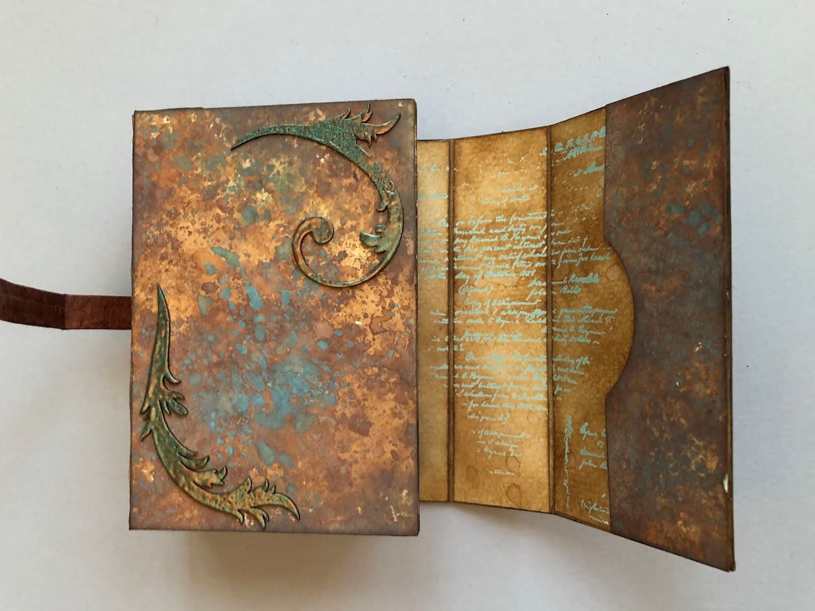
I cover an Eileen Hull wrapped journal base with handmade inked papers. On the short closure flap, I emboss a stamped image along the edge with Seth Apter baked texture in patina oxide. This powder creates the most wonderful finish, full of interest. 
I want the inside to coordinate with the colors of the exterior and to have a soothing appearance. In order to create this effect, I partially stamp (with Versamark ink) using a script stamp along the paper. This is coated with the new Emerald Creek Allure powder in Iceberg. 
Iceberg is a gorgeous translucent powder in a blue aqua color. It is very fine and works really well on super detailed images. When the embossing has cooled, I ink the paper with distress inks. The embossing creates a resist. I love the how the translucent color stands out against the background.
The album is assembled and mini notebooks and pocket folders are inserted. Now it is time to add the special details. 

I coat some feathery flourish chipboard laser cuts with patina oxide embossing powder and heat set. When cool, these are added in various locations.
Emerald Creek daisy brads are coated with embossing in patina oxide to coordinate and give a special finishing touch. I create a belt closure and add embossing to potions of the buckle. 
I am looking forward to putting my mind at ease by having this journal in hand. 
Perhaps you have been inspired by my take on this month's challenge? We would love to see your interpretation of Ordinary Day. Join the #ECMAR2019 challenge, if you dare!
Thank you so much for stopping by,
~Ann


supplies used:
copper 1/8" eyelets
Distress inks:
ground expresso, walnut stain
Distress oxide inks:
broken china, spiced marmalade, vintage photo, walnut stain
Distress paint: walnut stain
Eileen Hull / Sizzix wrapped journal scoreboards die
Emerald Creek Embossing Powders:
Baked Texture - Patina Oxide
Allure - Iceberg
Emerald Creek Forge:
daisy brads
Gypsy Soul Laser Cuts chipboard pieces:
feathery flourishes
Lineco: self-adhesive linen hinging tape
Tim Holtz / Stampers Anonymous stamps:
entomology, ornate trims
Tim Holtz Ideaology: buckles, fasteners
Versamark embossing ink
Xyron permanent adhesive


Wednesday, May 23, 2018

life observed


Hi everyone, I am here today to share a masculine card I created, that was inspired by Elton John's "Your Song." There are a number of challenges this month that are based on music; as I was working on an idea I had for manipulating the Tim Holtz vintage globe die, to use on a birthday card for a very special man, this Elton John song kept repeating in my head. I have to admit, I am a music lover, any and all types can grab my attention. It's as common to find me listening to BB King or Patsy Cline as it would be Skrillex, Martin Garrix, U2 or Pearl Jam. I don't; however, often listen to Elton - the fact that this song was constantly on my mind, was how I knew the direction this piece was going to take.
My initial intent was to create a three-dimensional surface on the globe, that would be held by a "metal" axis and armillary. To create this, I die cut the globe multiple times out of a heavy weight multi media paper. On one of the globes, I used texture paste to create "topography" on the areas representing land  within the globe. Once dry this paste was colored with various distress inks to accentuate the highs and lows. These pieces were carefully cut out to be adhered to the final globe construction. On a different globe, I inked the areas, designated as water, lightly with iced spruce distress ink and coated them with fractured ice embossing powder. This was melted with a heat gun and set aside to cool. Using an exact-o knife, I carefully cut out the "water" areas and "inlaid" these onto the globe that had the land masses. I removed the axis and base from another die cut and heat embossed it with Emerald Creek charred gold embossing powder (a long time favorite of mine.)
These pieces were then adhered to a full die cut. This globe is the focal point of my card cover.
I coated one of the new paper dolls, with embossing ink and sprinkled it with vintage beeswax Baked Texture. This step was repeated 3 times to give it a rich, vintage look.  The vintage boy rests seemingly on the armillary.
Next, I set out to create the perfect background for my centerpiece. I was fortunate recently to be the lucky winner of a Frilly and Funkie challenge hosted by the Funkie Junkie Boutique. I was able to use my "winnings" to acquire some of the newest release of distress oxide inks. What a wonderful addition of colors to my palette! I am so grateful for this prize. I layered aged mahogany, forest moss, tattered rose and bundled sage distress oxides onto a large sheet of bristol. When I was happy with the results, I flicked distress resist spray onto the background and coated it with more of the charred gold powder. Once the resist spray had dried, I heat set the embossing powder. This piece was cut to an 8" square. Using the lattice pattern from mixed media dies, I cut the bottom corner.  In the upper right corner, I used a coordinating stencil to layer the lattice pattern onto the background with forest moss distress oxide. Using a brayer I coated a script stamp with antique linen distress paint and randomly stamped the background. I inked all the edges with forest moss distress ink.
The inked panel was layered over a piece of heavyweight dark green card, which was then layered over a piece of card embossed all around the edges with charred gold. All three of of these layers sit above a piece of chipboard covered with burlap. 
The wording on the panel was selected from my stash of bits and pieces. The "how" industrious stickers were colored with botanical alcohol ink; "wonderful" was die cut from alphanumeric dies; "life is" was created with alpha tiles; "that" uses label letters;  "you're" are vintage scrabble pieces; "in my" is a portion of a quote chip, and the "world" letters are typography pieces that were painted with antique linen distress paint and inked with forest moss distress ink.  
I realize that the wording of my card does not exactly match with the song lyrics:" how wonderful life is while you're in the world" but I feel that my version works perfectly for the purpose of the card.
 Once the panel was complete I adhered it to a square, heavyweight card base I cut from bristol board. I hope that the recipient realizes how much it means to me that they're in my life. 
Thanks so much for taking the time to stop by the blog. 
I wish you a day filled with creativity!
~Ann 

I am entering this in: 
Emerald Creek Dares: Guy Style 
Simon Says Stamp Monday Challenge: Inspired By A Song
A Vintage Journey: Words and Music