Monday, October 28, 2019

the other side

Have you ever observed something so beautiful you were compelled to see what was inside?
The sheer beauty of it so incredible, you are drawn to it with no resistance.
That you succumb to the pull,
 only to find that what is inside is not at all what you had expected?
The other side is different,
 it is not glistening, it is somber, and quiet.
There are is no shimmering glory, only a dark and contemplative place.
This shrine was created drawing upon such an experience.
The Relics and Artifacts Gothic Arches Set spoke to me.
 Throughout my creative journey I have always admired the designs of the past.
The truly gifted architects and craftsmen that created everlasting structures.
I learned of them in my architectural studies, I researched them in my field experience, I draw upon them for their principals and attention to detail. I want to create a piece that reflects these elements.
I hope to invoke the warmth and glow of the stained glass windows that would be found within gothic mullions. The incredible clarity of vibrant colors and golden details highlighting everlasting designs. The same warmth that draws you to experience it from within. The exterior faces are finished using alcohol ink and gold paint, capturing the light like a beacon. The windows are stood on end to form a bay simulating a small chapel or apse.
Inside, I envision an old stone church. One created by masons, masters at their craft. The faux stone finish is stenciled on with texture paste and painted stone by stone, just as the structure would have been erected. A "wooden" floor mimics the timber floorboards.
And within the niche created, a statue of our lady, the Mother of Mercy stands. She is sculpted from Apoxie Sculpt and a Relics & Artifacts face, as taught by my fellow Muse, Sherry Matthews, in a 2016 Live from the Tribe video. The sculpture is painted, crackled and gilded. A somber presence, a reason to pause and reflect on all of the graces we have been given.
I have been blessed with many opportunities in my creative journey, 
both in the architecture field as well as the arts. 
I want to thank Sandra and David Evertson for the opportunity to be part of the Relics & Artifacts team these past months, 
and to wish them and my fellow Muse all the best as I continue on my artful journey. 

I truly appreciate you taking the time to visit today.
~Ann
xxx


I am entering this into the following challenges:


Wednesday, October 16, 2019

faerie hollow

Recently, my morning walks have left little doubt about the arrival of fall. Sightings of acorns and numerous pinecones littered across the path, falling leaves of varying colors, and the crisp air have me thinking about the creatures and faeries settling in for the coming winter. It inspired me to create something a little whimsical. Today I am on the Gypsy Soul Laser Cuts blog sharing faerie hollow, a little place to store some of my natural treasures found during my walks.
I begin with a Gypsy Soul Laser Cuts ATC sized faux book box. This box arrives flat, in 7 pieces. Whenever I create a three dimensional piece, I like to first put the pieces together without glue. This gives me an idea of what will go where, as well as a visual from which I can begin to imagine ways that I would like to decorate the piece. Once I have completed my "pre-assembly" I select a patterned paper that will be attached to the interior of the book.
I use the chipboard pieces as a template then cut the paper to the appropriate size. During this process, I always like to cut all my papers first. Then, once all of the cutting is complete, I adhere them. To keep track of which piece goes where, I label the back sides of the paper pieces with a letter or number and write that same letter/number on the corresponding chipboard. All of the writing ends up being covered when the papers are attached, it simply makes everything much easier when you are at the gluing stage. [Note: the insides of the box pieces will need to be sized to fit within the tabs, while the coverings for the outside edges of the box will need to extend to cover the interlocking tabs.] All of the edges of my cut papers are inked with gathered twigs distress ink. 
With all of the papers cut to size, the next step is to add paint to the chipboard. I paint all the edges of the chipboard pieces with brown paint. This piece is made of heavyweight chipboard so it doesn't warp when you add a thin coat of paint. I already know that I will be covering the book box with papers , so I do not bother to cover the entire pieces with paint, only the edges where my papers will end. The paint will give all the edges a more finished look.
When assembling the faux book box, I use a linen hinging tape along the spine where it attaches to the covers, this allows the "book" to open and close freely, without the worry of paper ripping or wearing out over time. If you don't have any hinging/binding tape, a piece of medical tape will also do the trick. Allow a gap between the spine and each cover. I cover the inside (gap) exposed portion of hinging tape with a piece of thin washi tape. This serves two purposes: covering any sticky portion of tape as well as presenting a clean and coordinating finished gap between the pieces. 
All of the cut papers are attached to the box with collage medium. If necessary, weight down the pieces while they dry to keep them from curling. For my purposes, I adhered the inside paper pieces then secured the box into the back cover piece, before I added the outside box covering (wood grained paper). You can work however you are most comfortable; however, if you would like to cut long strips of paper and wrap the outside corners of your box, it would be best to work like I have described. Be sure to cut out the slots from the base paper that will be attached to the back cover so that the box sides can easily fit into the openings.
When all of the interior papers are in place, I attach a faux wood-grained paper to the outside of the box portion of the book, as well as the back cover and spine. 
The "wood" is created with distress watercolor cardstock and the Sizzix Lumber 3D texture fades embossing folder. Once the grained pattern is embossed, I use a combination of inks, paints and mediums to create an authentic wood appearance. The papers are then cut and attached to the book box with collage medium. 
For the front cover, I cut a piece of Bristol to fit. I stamp some toadstools onto the lower section in archival ink, and color them with distress inks, using a water brush. The garden fairies small are the perfect scale for the stamped mushrooms. The set comes with six different fairies; for this piece, I am only using two of them. The rest will be used on a future piece.
I carefully remove the pieces and cover each one with Versamark embossing ink, then coat with a layer of mirror platinum embossing powder. The powder is heat set, then the fairies are set aside. Once cool, the fairies are attached to the cover paper with collage medium. Using a swirling stars stencil and perfect pearls, I add a bit of magic to the scene, which is completed by stamping the word "believe" in the upper left corner. 
When the book box is opened there is a small die cut mushroom in the corner of the box. I can't wait to begin filling this with small treasures found along my morning walks. 
I hope that you are inspired to create something of your own to keep your found treasures.
Thanks so much for stopping by today, 
I truly appreciate you taking the time. 
~Ann
 xxx 

supplies used:
Distress Archival ink
Distress Collage Medium: matte
Distress Crayon: black soot
Distress inks:
brushed corduroy, fired brick, forest moss, fossilized amber, tea stain, vintage photo, walnut stain
Distress Paint:
black soot, ground expresso, gathered twigs, vintage photo, walnut stain,
Emerald Creek Embossing Powder: mirror platinum
Gypsy Soul Laser Cuts:
ATC Sized Faux Book BoxGarden Fairies Small 
Linen Hinging Tape
Perfect Pearls: heirloom gold
Tim Holtz Ideaology paper stash: wallflower
Tim Holtz / Sizzix:
funky foliage dies, lumber 3D texture fades
Tim Holtz / Stampers Anonymous:
tiny toadstools, SSS Stamptember stencil
VersaMark embossing Ink

Thursday, October 10, 2019

grateful

If there is one month I associate with the fall season, it has to be October. 
Where I live, this month offers witness to the glory of mother nature by means of an autumnal show of stunning color. We watch as the leaves turn gorgeous shades of golden yellow, bronze, and red, before they are shed in preparation for a winter's lull. As I appreciate all the wonder that is presented to me, it gives me a wonderful opportunity to really give thanks for all that I have. This is the inspiration behind my gratitude journal for the Emerald Creek Dares Challenge this month.
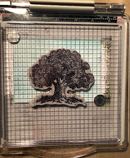
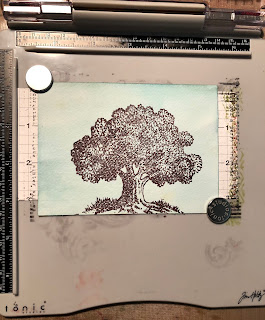
I begin by stamping the Emerald Creek Oak Tree Stamp with Archival ink onto watercolor paper that has been colored with a wash of Distress ink. Using a stamping platform, it is easy to re-stamp the upper portion of the tree with VersaMark embossing ink. 
I sprinkle embossing powders over the leafed section of the tree in a random pattern. I use Turkish Bronze, Taos Sunset, and Burnt Copper Leaves powders; each of which is absolutely beautiful on its own; however, I thought by using a blend of powders, I could achieve the variation that is so typically seen in nature. Once the embossing has cooled, I color the stamped and embossed image of the tree with distress inks. I also stamp the word "grateful" along the top edge. This panel becomes the cover of my gratitude journal. Using my Xyron creative station lite, I add adhesive to the back of the panel, and attach it to the notebook die cut. 
More of the inked watercolor paper is used to create the interior panels for the journal. These pieces are cut to size and then stamped with decaying leaf images with embossing ink. These leaves are coated with Burnt Copper Leaves embossing powder and heat set. When the embossing has cooled, these panels are attached to the interior of the book. 
I run my embossing pad along the sides and bottom of the front cover then add more of the Burnt Copper Leaves Embossing powder and heat set. This creates a wonderful finished edge that coordinates with both the inside and out. 
The back of the gratitude journal is covered in a faux wood paper created using a 3D embossing folder and inks to create a realistic looking (and feeling) panel. Another section of this faux wood runs along the top spine of the journal. 
Paper twine is strung between two eyelets to secure the signature inside. I want the signatures to be removable so that each year I can complete a new month of entries and keep the old ones to look over and know just how filled with blessings my life is.    
One thing I know I am grateful for is all of you, my followers, I appreciate you taking the time to stop by the blog and for all of your wonderful comments.
I hope that you are able to find time this fall to soak in some of the beauty that nature has to offer.
If you have the opportunity to create something fall/Halloween inspired, please consider joining this month's Emerald Creek Dares Challenge.
Thank you so much for stopping by today. 
~Ann
 xxx


I am entering this into the following challenges:


supplies used: 
1/8" eyelets
chipboard
Crop-a-dile tool
Distress Archival ink: ground expresso
Distress inks: 
broken china, brushed corduroy, forest moss, ground expresso, rusty hinge,
 vintage photo, walnut stain,  
Eileen Hull/Sizzix notebook die
Emerald Creek Art Stamps:
Emerald Creek Embossing powders:
paper twine
Tim Holtz/Sizzix 3D Texture Fade lumber
Tim Holtz/Stampers Anonymous leaf prints stamps (CMS273)
Tim Holtz stamping platform
VersMark embossing ink
watercolor paper
Xyron Creative Station Lite

Wednesday, October 2, 2019

open if you dare


October is finally upon us; for a lot of people, that means a Halloween crafting frenzy. I am joining in the fun today, sharing a fancy fold Halloween Card design for Gypsy Soul Laser Cuts.
I love making these types of cards, they are so fun to open and discover all that lies inside, and the design allows for many opportunities to incorporate all sorts of holiday ephemera. 
Let's get started.
To create the card base, you will need a square piece of paper. For this card, I have used a 12x12 sheet of black cardstock. The piece is folded into quadrants and then, using a bone folder, I ensure the creases are sharp. Next, open the sheet to a flat position and fold the entire square in half, diagonally. Use the bone folder to ensure a crisp diagonal fold and then flatten the sheet once more. The card base is ready to be adorned.
Using some of my favorite decorative papers, I cut a 6x6 square panel that will be attached to the card cover. I build my scene on this paper and set it aside. It is important to note that I set this aside and always attach the cover panel last. This allows me to attach fasteners through the card base that can be concealed. I also find that creating the cover panel first, allows me to set the tone and theme that can then carry throughout the interior. Since the cover is not attached, I can refer back to the design without having to open and close the card multiple times. Most importantly, as many of you know, I love making the cover dimensional, when the panel is secured in place the open card does not lay flat. It is much easier creating the interior when it is flat, thus not crushing the cover design. 
The focal point on the cover of my card is one of the houses from the Gypsy Soul Laser Cuts haunted houses set paired with "frightful" from the Halloween word set. The haunted houses set come with three different designs, I paint both sides of the house I am using with black soot paint. Once dry, I coat the front side with Deco Art one step crackle and allow it to work its magic. Once the crackled finish is completely dry; to accentuate the crackle and dull some of the shine, I rub distress crayon in fired brick and gathered twigs over the surface and into the cracks. 
I color a piece of vellum with fossilized amber distress oxide, spritz with water and allow to dry. I use this vellum to fill the window openings. From the back side, pieces sized to cover the entire openings are adhered with collage medium around the window opening edges. 
I carefully remove the word "frightful" from the Halloween word set. This set contains five Halloween words, each in a different font. "Frightful" is an extremely delicate font, use extra caution when removing this from the surround. Once I have removed the word, I use use twisted citron distress oxide ink to add color to the chipboard. I add the ink in layers, allowing to dry in between each coat to give the word a wonderful intensity of color. I then coat the colored word with glossy accents, to add stability and shine. I set the coated word aside to dry completely.
While the glossy accents is drying, I am able to work on the background. Using a die, I cut random patterns of stars from the top of the square. I color a 6x6 square of mixed media heavy stock with layers of twisted citron distress oxide, distress ink, and distress spray stain. When I achieve the desired look, this piece is layered beneath the decorative paper. The beautiful layers of twisted citron show through the star die cut openings. I adhere the haunted house piece to the background with distress collage medium and set weights on it until the collage medium is dry, to keep it flat. 
The two bats from the black creepy critters set are added to the starry sky, in addition to a die cut crescent moon face. Once the cover design is complete, The fully dried frightful word is adhered to the house front with collage medium. As I mentioned before, the completed cover piece is set aside while I work on the card interior.
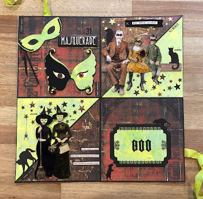
The fancy fold card interiors can be as simple or complex as you desire. Keeping with the Halloween theme, I used some colored Ideaology paper dolls, masquerade die cuts, quote chips, halloween remnant rubs, clippings stickers, and incorporated the remaining pieces from the black creepy critters set among the panels. There are no limits to designing the fancy fold interior. 
One thing to note is that when attaching pieces to the triangular folding panels, only attach a piece that spans both panels onto one of the triangles. This way, when the card is folded closed, the extended pieces will not impede the process and can remain flat. If necessary, you can always test out the design with removable tape to be sure everything functions properly before doing the final gluing. The pictures above show how the paper dolls are only attached on one of the triangular panels. The picture on the right shows how the children were only attached on the base triangle for the quadrant while the gentleman was only attached to the upper triangle.
Here are some pictures of the inside panels. 
These cards can become a bit thick when you add a lot of layers inside. I like to wrap the base with a coordinating ribbon that can be tied together to keep the card closed (for mailing or storage.) I attach this ribbon to the card base cardstock before I add the cover and back panels. The ribbon is completely concealed, except for the lengths to be tied together.
  I hope that you have a wonderful October, filled with creativity.
Thank you so much for stopping by today, 
I truly appreciate it.
~Ann
 xxx


supplies:
DecoArt One step crackle
Distress Archival Ink: black soot
Distress Collage Medium: matte
Distress Crayon: fired brick, gathered twigs
Distress Ink: black soot, twisted citron,
Distress Oxide Ink: fossilized amber, twisted citron
Distress Paint: black soot
Distress Spray Stain: twisted citron
Gypsy Soul Laser Cuts:
Black Creepy Critters SetHalloween Word SetHaunted Houses Set
Tim Holtz Ideaology:
abandoned paper stash, halloween clippings, halloween remnant rubs,
halloween ancestors paper dolls, clippings stickers, crinkle ribbon, halloween quote chips,
creepy eyes, sticker book curiosities, tiny attacher
Tim Holtz / Sizzix Alterations: spooktacular alphabet, masquerade, witchcraft, stacked label,