Monday, December 24, 2018

shining skyline

It seems that December has passed so quickly, I can hardly believe this will be last my post in the designer spotlight for Simon Says Stamp's Monday Challenge. What an honor to have my creations showcased alongside some of my favorite designers. It has been such a blessing and I am extremely grateful to Simon Says Stamp for this wonderful opportunity; as well as all of my visitors, for your lovely comments and kind words, they truly mean the world to me. 

I hope that you are excited about this week's challenge "party time"

I am excited to share my pop-up New Year's card with you today. I just love making different interactive cards; they really are a lot of fun to make as well as to receive. 
When I think of New Years Eve celebrations, I think of silver and black, the NYC crystal ball drop, fireworks around the world, and everything glitz and glam, ringing in a new year full of potential. I decided to use this as inspiration for my project this week.
I start with a 6"x12" piece of heavyweight black cardstock for the base, everything is built up from there. I create the card front as its own entity and attach it after it is completed, this way if I make any mistakes, I am not having to re-do the entire card, only the section I am working on. The card front is a layering of silver metallic kraft beneath a piece of craft cardstock that has been diecut in opposite corners using the harlequin mixed media die. The topmost layer is heavyweight black card stock that contains the same cutouts as the kraft layer, however, they are slightly shifted outward from the center. This allows a slim edge of the kraft layer to be exposed, and to add interest. 
I used the center diagonal that the cutouts formed to attach the 2019 numbers. I give the numbers depth by cutting 4 times with black and the top layer metallic kraft. All of these layers are glued together and then the thick number is adhered in place. 
The interior of the card features a glittery sky that shines behind the cityscape. This background is created by applying embossing ink through the speckles stencil, then sprinkling the design with sticky embossing powder and heating with a heat tool. The heat warms the powder creating a sticky substance. I sprinkle the sticky areas with a (super fine) silver glitter while the embossing is warm. When I have coated all of the areas with glitter, I re-heat with my heat gun to ensure that the glitter embeds itself and then set this piece aside to cool. When cool, I brush off any excess glitter with a dry paint brush. 
Next, I create each of the skyline pieces that will stand prominently in front of the sparkly sky. [disclaimer: I have seen many ways to make pop up cards, this is my first. Some of the methods I use may be able to be improved, especially with more knowledge and experience. My mechanisms work, however, there may be different ways to achieve the same outcome.] Using a sheet of black cardstock 6"w x 10"l I score at 5-3/4"l. I place the cityscape die along the score line. Using the dimensional plate, I locate the non-cutting seam at the location of the crease. This will ensure that the bottom edge of the die will not cut through the paper. I repeat the process with the second cityscape die however, this base is scored at 5-3/8" so that when placed on the card base, the two rows of buildings will be situated with a gap in between. 
*I have staggered the die and dimensional cutting plate to demonstrate the layering along the scoreline, when die cutting these pieces everything is layered directly on top of each other.
 Each cityscape is then cut from kraft paper and the section of skyline that will sit forefront in the card, is cut a third time from metallic kraft. The plain kraft paper cuts are layered onto the folded pieces creating shadow lines. The metallic kraft is then adhered onto its respective skyline, creating a similar layered appearance to the card front (but in reverse order.)
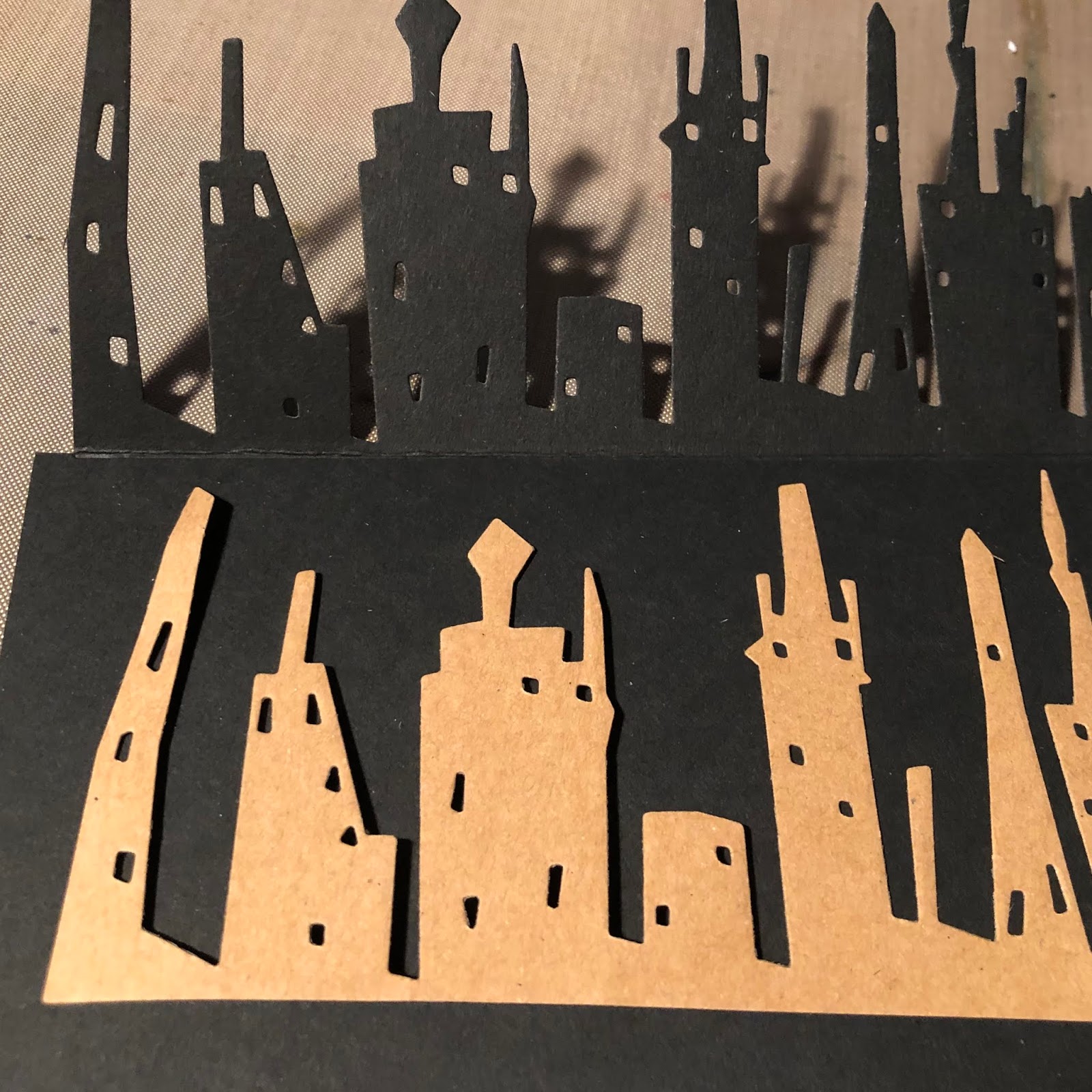
When all the glue has dried, these pieces are attached to the card base. Between the rear skyline and the sparkling sky I scored small strips of paper to be situated in the gap. These strips are attached to the building back then a scored flat 1/4" section that bridges the gap, then attached to the background panel. A similar mechanism ties the front row of buildings to the back row, this time the scores occur at 3/8" to create the flat area between the buildings. These strips of paper are what tie the card together and force the buildings to "stand upright" when the card is in the open position. 
The card sentiment is created with alphanumeric dies. I cut two pieces of cardstock (one black and one kraft) to the dimensions of the flat base area (in front of the cityscape buildings.) I align the letters to form the words MAY IT SHINE using a straight edge; and when the placement is correct, I attach a piece of post-it tape over the dies to keep them in place when passing through the die cutting machine. I cut one row at a time. When all three rows are complete, I trim the left edge of the kraft paper piece so that I can slide it to create a shadow line. A piece of metallic kraft is located beneath the diecut layers and this entire composition is adhered to the card base.
The card folds (relatively) flat for mailing and when opened, the buildings stand erect amidst a sky shining with possibility.
May your holidays be merry and bright and the new year filled with hope. 
~Ann
 xxx
I hope that you have enjoyed seeing how my pop-up card was created. Perhaps you are inspired to make a pop-up card of your own. We would love to have you create something for this week's "party time" theme on the Simon Says Stamp Monday Challenge. This challenge runs for two weeks so there is plenty of time to get creative. One lucky winner will receive a gift voucher to the Simon Says Stamp store!
Thanks again for visiting my blog today. I love reading your comments or answering questions, it's always a treat when you share your thoughts with me. I have included a list below with all of the supplies I used to create my card. Any of the products that are available from Simon Says Stamp are listed with links. 
Supplies used:
black cardstock heavyweight
kraft paper
superfine silver glitter
Tim Holtz Ideaology: paper stash metallic kraft
Tim Holtz / Sizzix alterations dies:
Tim Holtz / Stampers Anonymous: speckles stencil 
Versamark embossing ink

Wednesday, December 19, 2018

madonna medallions

Hello everyone, I am on the Gypsy Soul Laser Cuts Blog today,
 sharing some very special pieces that I have created using Gypsy Soul Laser Cuts artist trading coins. These coins are very popular, and I wanted to try my hard at making some.

With Christmas fast approaching, my thoughts have placed Mary, and the upcoming birth, forefront in my mind. I thought it would be wonderful to create some of these coins with iconic images of the madonna, so that I can slip a few into my holiday cards. They could easily be converted to ornaments by poking a hole and stringing a gold thread for hanging.
The coins are a perfect size to manipulate and make your own in many different ways and styles; I am so glad that I decided to create some of my own. One piece of advice: once you get started, it is hard to stop making them, so be sure to get a number of packs or you will find yourself wanting more before the paint has dried...I learned this the hard way. The coins arrive in a pack of three, sturdy, 2 1/2" diameter circles. They can take any type of mixed media you want to work with.
 I have a growing collection of religious images, some are in the form of card-fronts that I have received and saved, clippings from a monthly publication that I read, religious calendars from years past, and postcards. I sort through all of the pieces and select a few to work with. Using a circle punch, I crop the madonna images.
These circles are then adhered to the coin bases using collage medium. I coat the coin itself as well as the top of the image. This will facilitate the next layers that I will be adding.
While the collage medium is drying, I gather stencils, stamps, paints, inks and embossing powders to use on my coins. The best part about the artist trading coins is the creative freedom you have. There is no right or wrong, you can let your imagination take your creativity wherever it leads.
Following are some samples of my madonna medallions.
I have included a brief description of the mediums used on that particular face.
crackle, gold leaf, stamping, vintage beeswax embossing powder 
stamping, gold embossing
texture paste, gilding wax, gold leaf
crackle, antiquing stain, gilding, pen and ink
stamp, deep sea embossing powder, copper perfect pearls
partial stamp, chunky rust embossing powder, distress crayon, gold paint pen
I am eager to create more of these coins with different themes, it is such a wonderful way to try out ideas and play with mediums. They can be as simple or as complicated as you like.

Wishing you and yours a joyous holiday season;
  I look forward to sharing more projects in the new year.
Thank you so much for taking the time to visit, it means a lot to me.
~Ann
 xx


Emerald Creek baked texture embossing powders:
deep sea, chunky rust, vintage beeswax
Gypsy Soul Laser Cuts:
  Artist Trading Coins
Ranger texture paste - transparent


Monday, December 17, 2018

sewing "notions" journal

Hello everyone,
I am so happy to be back for another week on the Simon Says Stamp Monday Challenge blog.
My December in the designer spotlight is moving quickly, and the month is very busy, I just want to savor this wonderful opportunity. I am grateful to Lols and the entire design team from the Simon Says Stamp Monday Challenge for their encouragement and support, it means so much to me.

I hope that you are excited about this week's challenge "stitch it up." We would like to see you add some stitching to your project (real or faux).


I had quite a few ideas regarding this weeks theme and settled on a journal to store ideas or "notions" for sewing projects. My mom can do amazing things with her sewing machine and, thankfully, has taught my daughter to love creating with it as much as she does. I am comfortable running an embroidery on the machine; however, when it comes to putting needle to my paper crafting, I am somewhat of a scaredy cat. This journal will be a special place for us to generate new ideas and also make notes of changes for works in progress.
I start with a die cut journal base made from chipboard using the Eileen Hull/Sizzix journal scoreboards die. This is definitely one of my go to dies for all sorts of projects, it is really versatile. There are various ways that the covers can be put together. For my notions journal, I assemble the covers to accommodate two signatures. When I began, I was still unsure how I would be finishing the spine of the book; for this reason, I painted both spines with black soot distress paint and allowed to dry. The black will help to conceal any raw edges if I decide to cover the spine with paper or something that does not wrap the corners.
While the paint is drying, I die cut a base dress form from lightweight chipboard with the Tim Holtz/Sizzix sewing room bigz die. I cut a second dress form from woodgrain cardstock and a third from heavyweight cardstock covered with adhesive backed linen textile surfaces. The woodgrain cardstock is inked with distress inks in vintage photo, gathered twigs, ground expresso and walnut stain to simulate an aged wooden dress form frame. I trim the top finial and the bottom stand sections and attach them to the chipboard piece with collage medium. The linen covered bodice area is also trimmed, inked around the edges, and then attached to the form base. When the the glue is dry, I stamp the word PARIS from a section of a stamp onto the bodice with black soot archival ink. 
Next, I die cut the wings from metallic kraft stock with the Tim Holtz/Sizzix layered angel wings die. The largest layer is debossed with the wings texture fades embossing folder. The middle wing layer is embossed in the texture fade as well but on the reverse side so that the texture is raised. The topmost layer remains plain metallic gold. I lightly sand all of the wing pieces and ink around the edges. The wing layers are stacked and glued together along their innermost edges with collage medium. 
The winged dress form is the focal point of my cover. I attach a milagros adornment to the center of the bodice with a small star brad. This entire piece is situated above a strip of paper cut from the  Christmas paper stash. I just love how the wings and foiled stars from the paper play off of each other. The strip of paper is distressed along the edges and inked with gathered twigs before being attached to a piece of lightly sanded, classic black kraft stock. 

It is at this point that I realize the spine should coordinate with the main focal point, to unify the book design. To accomplish this, I wrap the outside spine with the same adhesive backed linen as the dress form. The edges are inked with gathered twigs distress ink.

I want to incorporate more of the woodgrain into the cover design. The word NOTIONS is cut out from a strip of inked, woodgrain cardstock using alphanumeric thinlits. A piece of lightly sanded gold metallic kraft is positioned and attached below the cutouts section. The center portions of the O's are glued into place. This title strip is stitched onto the base paper layer of the cover and the entire composition is attached to the journal cover with Scor-Tape. 
 
The inside covers of the journal are covered with a tweed design paper in keeping with the theme. Before attaching these papers, I cover the inside spine with linen hinging tape (colored black) to reinforce the binding. A "measuring tape" strip of paper is incorporated along the center of the inside spine. Although it is not necessary, I like to reinforce the holes where the elastic is strung. To do this, I set 1/8" eyelets at the hole locations. I feel it gives the journal a finished look. 
Two signatures are covered with coordinating "textile" patterned papers. Black kraft die cut labels are added to each leaving a spot to note what the signature will pertain to.
The final touch to completing my journal was to add the word SEW along the outside spine. I die cut the letters from medium weight chipboard with the Tim Holtz/Sizzix billboard alphabet die. The letters are covered with gold leaf and then adhered to the spine with collage medium.
I have so much admiration for projects where sewing is incorporated into the design, it really adds another dimension to everything. One of my goals for the upcoming year is to incorporate more stitching into my paper crafting. I hope that I can make it happen.

Thank you so much for visiting. I hope that you are able to enjoy these last precious weeks of 2018, and maybe even squeeze in a bit of creative time.
~Ann
 xxx


Perhaps you have been inspired to create something for this week's challenge. We love seeing your take on the themes when you join in the fun. There is a $50 gift voucher to SIMON Says Stamp for one lucky participant, but you can only win it if you are in it!
Thanks again for visiting my blog today. I love reading your comments or answering questions, it's always a treat when you share your thoughts with me. I have included a list below with all of the supplies I used to create my journal. Any of the products that are available from Simon Says Stamp are listed with links. 
Supplies used:
Distress collage medium: matte
 black soot, gathered twigs, ground expresso, vintage photo, walnut stain
Distress paint: black soot
Eileen Hull / Sizzix Scoreboard Journal XL die 
Tim Holtz ideaology:
Tim Holtz / Sizzix dies:
Tim Holtz / Sizzix texture fades: wings

Monday, December 10, 2018

sending warm winter wishes

Hello everyone,
 I first would like to say thank you, so very much, for the wonderful comments and supportive words about my Simon Says Stamp Monday Challenge project last week. I am grateful for the outpouring of love and kindness, it means the world to me.

I hope that you enjoy what I have created for this week's challenge "warm winter wishes." 

As the holidays are getting closer, it provides a perfect opportunity to send warm wishes to our family and friends near and far. This week I am sharing a few Christmas cards I created using some of my favorite Tim Holtz products.
It was love at first sight when I laid eyes on the Tim Holtz wise men thinlits dies from Sizzix. Faith plays a huge role in my life and, to me, this die is so perfectly Christmas. I knew that I wanted to share its beauty and meaning with many. The die is made without a distinct framed edge, which allows you to locate the piece anywhere within your surface area and easily accommodate whatever size card you are making. I have chosen to use the die in a horizontal card design, by elongating the front and rear edge to create the look of a sand dune; this creates an appearance that the magi are set quite a distance away from the star which they are following.
My initial idea for the cards was to create a white on white card with gold accents. In order for the white outline of the wise men to be clearly defined, I layer four die cuts onto each other. I place a metallic gold die cut between this layered piece and the base. The shadow line allows you to visualize the full design. Although the card is beautiful, it wasn't what I had hoped. I knew I would need some contrast.
The next card design in my process incorporates the same horizontal design with the die; I love the way it appears as if the magi are indeed following a star. To create the contrast, I exchanged the white base card for back. I also exchange the gold metallic piece for silver. Monochromatic cards seem to be extremely popular. This card, in my opinion, although nice, seems cold. Not exactly what I am hoping to convey-warm wishes.
I decide to try for a navy blue base and return to the gold metallic accents. This card is beautiful; however, I know it could be so much more. Perhaps I am more of a color person than I realize.
The next step in my process is to bring inks onto the design. I love working with inks as much as I enjoy manipulating paper.
 Working with distress oxides, I create background panels. Each panel uses a specific palette and is created by smooshing the ink onto my craft mat, spritzing with water, and then tapping the bristol paper into the ink. I use a heat gun to dry between the different layers, adding depth to the color. When I am satisfied with the look, I add chipped sapphire distress ink along all the edges, and throughout the oxide area. When the panel is completely dry, I add splatters of either tarnished brass or brushed pewter distress paint (depending on which color of metallic kraft is being used) to the sky to create a sprinkling of stars. Some of the panels also have a sprinkling of distress mica spray amongst the splatter stars. The die cut star of Bethlehem and the wisemen are attached to the panel.
The first cards I assembled with the inked backgrounds use the white die cut wise men. Then, I thought it would be interesting to see what the cards would look like if I use navy blue cardstock for the wisemen keeping with the inked background panel.
These are some of my favorite cards, and I am so excited to share them with friends and family this holiday season, sending warm winter wishes.
 I love the Simon Says Stamp Tiny Words Christmas stamps. There are so many wonderful sentiments to choose from. The text is sized perfectly to fit along the bottom edge of my extended sand dune. The sentiments are embossed on each card with Ranger extra fine embossing powder in gold or silver (also dependent on the color of metallic kraft that is used on that particular card.)
I am often amazed at how easy it is for some people to create multiples of the exact same card; for me this seems to be a nearly impossible task. Once I get started, I am always tweaking or adjusting or trying a new take on the design I have in mind. I love that each handmade card someone receives is unique. I hope that they enjoy the cards as much as I enjoyed making them.
Wishing you a blessed holiday season.
~Ann
 xxx


Maybe you have been inspired to create something for this week's challenge. I do hope that you join the fun, we love seeing your take on the themes. There is a $50 gift voucher to SIMON Says Stamp for one lucky participant, but you can only win it if you are in it!
Thanks so much for stopping by to visit my blog, please leave a comment or question, it's always a treat when you share your thoughts. I have included a list below with all of the supplies I used to create my cards. Any of the products that are available from Simon Says Stamp are listed below with links. 
Supplies used:
Distress Ink: chipped sapphire
aged mahogany, black soot, blueprint sketch, faded jeans, hickory smoke, 
seedless preserves, stormy sky, tattered rose, wilted violet  
Distress paint: brushed pewter, tarnished brass 
Ranger embossing powder: gold, silver
Ranger heat tool
Scor-Pal Scor-Tape: 1 1/2" wide
Simon Says Stamp: tiny words christmas
Sizzix: Big Shot
Strathmore: Bristol
Tim Holtz Idea-ology: metallic kraft stock
Tim Holtz / Sizzix: wise men thinlits
Heavyweight black card stock
Heavyweight navy blue card stock
Heavyweight white card stock