Tuesday, July 28, 2020

retro recipe journal

I love the simplicity of summer days: outdoor barbecues, picnics, and the lack of scheduled activities and responsibilities. Summer days give us time to relax. Lately, I've noticed a trend in journaling towards junk journals. I thought it would be fun to create a vintage styled "favorite recipe" junk journal, combining the simplicity of vintage style with modern day trends. Today I am on the Gypsy Soul Laser Cuts Blog sharing details for my retro recipe journal.
Gypsy Soul Laser Cuts art journal is the perfect base for this project. It contains sixteen chipboard pieces of varying sizes and textures and two binding rings. All of the pages are punched to accommodate ring style binding. Four of the pieces are "tabbed" perfect for creating different sections, and if you want to add your own pages, 5x7 fits perfectly.
I wanted my journal to have a retro vibe, so I selected a vintage red and white gingham check for the cover, then I added a black stripe along the binding edge. I embossed the favorite recipes title with a black glossy finish and added it along the right side of the cover. Since the cover will receive the most use opening and closing, I added chrome grommets to the punched holes. This will allow the journal to open easily.
Next, I searched for vintage images of recipes and advertisements to include on the front sides of the chipboard pages. I intentionally left the back sides of the pages unfinished to allow for artist freedom when the journal is put to use.
The images were cut out and added to the smaller chipboard pieces that are located in front of the tabbed dividers. On pages where the image was smaller, I incorporated the red and white checked paper, as well as some black paper details.
Each of the tabbed divider pages are covered with a vintage ledger paper. I thought it would be fun to add titles to the tabbed portion, in the keeping with the retro recipe theme. I used label letters to spell out each course, ie. salads, soups, entrees, and deserts.
With the main pages complete, I created some clips that can be used in the journal. For these, I used the Gypsy Soul Laser Cuts kitchen utensils set. I added a coat of black gesso to each side of the pieces. When  the gesso was dry, I attached a paper clip to the back side with strong glue and set aside to dry. The oven mitt piece was covered with gingham and black paper before the clip was attached to one side.
The only thing left to do is cut some of your favorite papers to be added to the journal. I cut a few different types of paper in 5"x7" size then, using the existing page holes as a guide, I marked each page. Using a hole punch, I created the holes and slipped all the pages into the journal where I wanted them. The binding rings make adding and removing pages a breeze.
I think the possibilities for the Gypsy Soul Laser Cuts art journal are endless. You can turn this piece into any style of your liking quickly and easily. The size is perfect for slipping into your bag and taking it with you wherever you go.
Perhaps I've inspired you to create your own journal, I'd love to see your take on this piece.
Thanks so much for taking the time to stop by today,
I really appreciate it.
~Ann
 xxx


supplies used:
black gesso
black embossing powder
found papers and images
1/4" grommets
Gypsy Soul Laser Cuts:
art journalfavorite recipes titlekitchen utensils
paper clips
sookwang double sided adhesive
Tim Holtz Ideaology: label letters
Versamark embossing ink

Monday, July 27, 2020

A to Z journal collaboration for StencilGirl


A while ago Tina Walker, artist and columnist for StencilGirl Products, introduced a new StencilGirl collaborative challenge, which I was thrilled to join. Today, on the StencilGirl Talk blog, Tina is sharing all the details about the collaboration and her project, as well as links to each of the participating artists' projects.
The challenge presented was that a person would create a unique A to Z journal in a theme of their choosing. Each person in the collaboration chose and committed to a different theme; there were no two alike. From there, we were to "create 26 art journal pages, one each inspired by each letter of the alphabet, A to Z." We were allowed to use any mediums of our choosing, but strictly SG stencils.
 
A is for arrows, B is for bamboo, C is for circles, D is for diagonal stripes.
 
As soon as the collaboration was announced, I had an idea in mind for how I would like to create my A to Z journal. Having a background in architecture and an appreciation for the art of paper cutting, I wanted to use cut patterns to form the letters of the alphabet. Each of the cut pattern designs is either a full StencilGirl stencil pattern, formed using small bits of design from a stencil, or uses a stencil design as the basis for the cut pattern.
 
E is for empty, F is for floral, G is for greek key, H is for hearts.
To begin, I drew each letter of the alphabet in uppercase on pieces of white cardstock using a ruler. These would be the boundaries for the designs. Once all of the alphabet was drawn onto the pages, it was time to select the patterns to go with each letter. I am not going to say this was an easy task; some letters proved much more difficult than others. There were letters that required a lot of  manipulating the stencil to draw a pattern, while others were straight forward. 
I is for inkblot, J is for jonquil, K is for kaleidoscope, L is for lattice.
Once the design was settled, I needed to figure out which sections would remain intact and which sections would be cut out. I learned pretty quickly that in order for the letter form to be prominent, there needed to be plenty of open areas along the edges, but that the design also need to be attached to the edges. Needless to say, there were a few do-overs in the process.
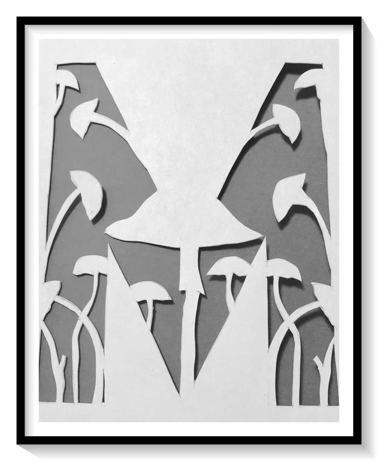
Mis for mushrooms, N is for numbers, O is for ogee, P is for paisley.
Many of the stencils I used were from the StencilGirl ATC collections. The scale was perfect for the size of my letters. I also used a few standard size stencils. For each page shown, I have listed the pattern name. At the bottom of the post I have a list of the StencilGirl Stencils used. 
Q is for quatrefoil, R is for rectangles, S is for stripes, T is for triangles.
Once I understood the balance that was needed between the positive and negative spaces, it was really fun deciding on what pattern would be used for each letter. I do have my favorite pages, but I think the best part was when they were all put together in the journal.
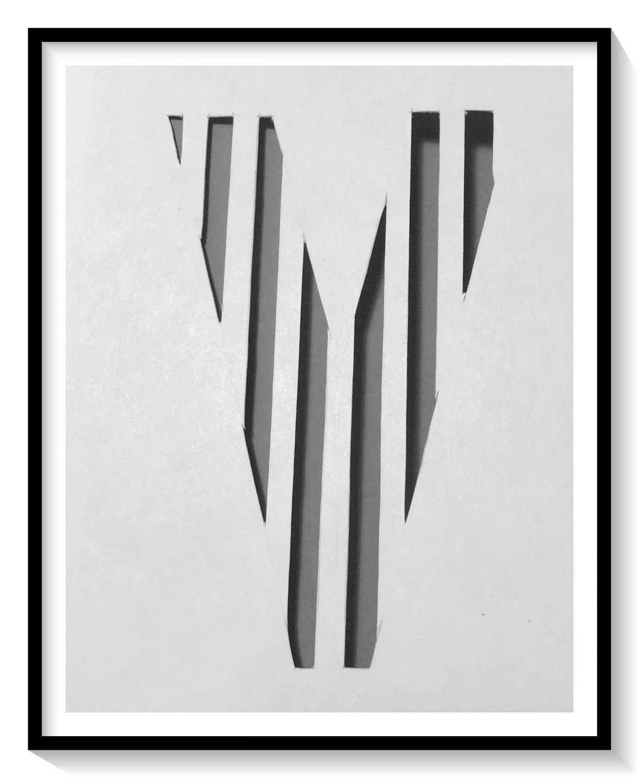
U is for unbalanced stripes, V is for vertical stripes, W is for windowpane, X is for x's.
Using a method of binding I learned in a bookmaking class taught by Seth Apter, I created a binding bar that was the height of the pages. Two pieces of chipboard, wrapped in black paper, create the front and back covers. Each letter page was attached with a sheet of vellum in between.
Y is for yin yang, Z is for zigzag.

Here is a short flip-through video for you to see the book in its entirety. 


I was thrilled to be part of the StencilGirl A to Z challenge. I hope that you can find time to visit the StencilGirl Talk blog to find links to all of the other artists that were a part of the challenge, as well as learn about Tina's fabulous journal and thoughts on the collaborative. 
You can find it here.

Thanks so much for stopping by today, 
I really appreciate you taking the time and hope that I have inspired you to get creative.
~Ann

StencilGirl stencils used:


Tuesday, June 23, 2020

all are welcome

Lately there seems to be unrest in so many aspects of life,
I felt the need to create a piece dedicated to unity.
This accordion book I am sharing on the GSLC blog is made with a few different pieces from Gypsy Soul Laser Cuts.
When I begin gathering pieces to create the accordion,
I envision many different types of neighborhoods and buildings.
I choose the house oddities box for its variety of building shapes that will become the "pages."
As my ideas for the finished piece become clearer, I decide on having the central panel unfold in the shape of a heart. The GSLC book of love mini album covers are perfect for this use.
I arrange all the pieces in a horizontal line to determine the final arrangement. Two of the accordion "pages" will comprised of multiple shapes overlaid and glued together.
The house oddities box contains a door panel, this becomes the cover of the accordion. I cut two pieces of scrap chipboard the exact same size as the door panel. One of these will become the back cover of the album, while the other will give reinforcement to the front door cover piece. I use inks and paints to color a piece of woodgrain cardstock creating the look of stained wood. When this is dry, I remove the inner panels from the GSLC door and the adhere the "wood" to the door panel with collage medium. I weight it down while drying to ensure that the panel remains flat.
Using an Exacto knife, I carefully cut out the open inner panel sections.
The raised panels of the door are created by adhering the remaining "wood" pieces to only the innermost rectangles from the door panel. When everything is put back into place, the panel "frames" painted with brown acrylic, appear to be recessed from the wood grained raised pieces.
 The back sides of all the pages will covered with patterned paper. Once I select a pattern appropriate for my theme, I trace all of the pages onto the paper, cut them out and label them. This makes it easier to distinguish which pieces go where during the final assembly.  Before adding any of the finishes, I paint the edges of all the interior pages with black paint, this creates a finished look when the accordion is complete.
Each of the building "pages" inside the accordion contain a different wall finish. I decide on wood siding, brick, stone, and stucco, then determine which building shape suits each finish best. 
To create the look of wood siding, I once again use woodgrain paper. Colored with various inks to highlight the woodgrain pattern, the paper is cut into strips which are attached to the house form in an overlapping pattern, mimicking siding.
The brick wall is created from a brick patterned die cut. Glue is added only to the back of the brick pieces of the die cut; when the die cut is placed upon the building shape, I rub lightly over the pattern allowing the bricks to adhere to the chipboard. The remaining paper is lifted off leaving the recessed mortar lines. These bricks are colored with inks and then coated with collage medium. The mortar lines are painted in with a fine paintbrush and acrylic paint.
The stone wall is created with texture paste through a stencil onto the chipboard building shape. When the texture paste has dried completely, the stones and mortar lines are painted in varying shades of gray to look like real stone.
The stucco finish building wall is created by covering the shape with grit paste.
When the paste is dry, acrylic paint is sponged on. Once the paint is dry, the surface is randomly inked with shades of brown ink to give the stucco a weathered and aged feel.
I work on the central heart panel next. Using a linen hinging tape, I secure the two covers from the book of love heart mini album together, aligning the pieces and allowing for the fold. I paint the front side of the heart with two layers of acrylic paint allowing to dry between coats. Knowing I want the heart to look like it has been graffitied, I use a font generator to select the desired style. I print the words "WE ARE ONE" and trace the outlines onto the painted heart. Then I paint in the letters and outline them. I ink the painted heart with black ink to created an aged look. Once complete, the heart is covered with one step crackle. This is set aside. A few hours later, I rub a dark glaze into the cracks and re-ink the edges.
Each of the pages contains various combinations of paper dolls, representing the many people in our world. I color the paper dolls with Copic markers, Distress crayons and ink. The paper dolls are attached to each page with collage medium and weighted down to dry.
The insides of the front and back covers are painted with brown acrylic paint.
A patterned paper of many different portraits is cut to fit each of the inside covers and attached with collage medium. This is then coated with one step crackle and when dry an antiquing glaze is rubbed into the cracks and allowed to dry.
With all of the page fronts complete, I attach the papers to the back sides of the pages and ink around the edges with black ink. Now it is time to assemble the accordion.
We are all tied together by a common thread, this is a loose and fragile connection. I decide to connect my pages with simple burlap string tied through eyelets. I align all the pages along the bottom and attach the eyelets. [Note: the eyelets would be easier to attach before adding the paper dolls.] When all the eyelets are in place, I tie the respective holes together creating the accordion.
Lastly, I add some small talk quote stickers to the interior pages to create a message:
replace fear of the unknown with curiosity
find joy
have hope
we are one
cultivate kindness
together is the best place to be
learn from yesterday, live for today, hope for tomorrow
I understand that there is always knowledge to be gained and room to grow to further our understanding of the world and people around us.
I believe that we are all one;
we all deserve the patience and understanding that is required to live in peace with one another.
If there were no differences among us, what an unfulfilled life we would live.
Thank you for stopping by the blog, I truly appreciate it.
 Wishing you peace in these trying times.
~Ann
  xxx


supplies used:
chipboard
Copic markers
DecoArt one step crackle
Distress collage medium: matte
Distress grit paste
Distress inks
Distress paints
Distress texture paste: opaque
Distress woodgrain cardstock
1/8" eyelets
Gypsy Soul Laser Cuts:
book of love heart mini albumhouse oddities box
May Arts burlap string: natural
Tim Holtz Ideaology: paper dolls, paper stash, small talk stickers
Tim Holtz Sizzix Alterations strip die: brick wall