Tuesday, September 22, 2020

specimen shattered


Next week I will begin decorating the house for Halloween. For me, this is the best part of the holiday. I have a china cabinet in the dining room which I convert into a creepy cabinet of curiosities.  I thought it would be fun to make a piece to add to my curiosities. Using the Gypsy Soul Laser Cuts 6x6 shadowbox as a base, I created the specimen box. Some shards of mica formed the perfect "shattered" enclosure.


As mentioned, I begin with a 6x6 shadowbox kit from GSLC. The eight piece kit arrives flat. It's a good idea to wipe down the edges of each of the sections before getting started, to remove any residue from the laser cutting process. Any soft rag or paper towel will do the trick. Once the edges have been wiped clean, I like to test assemble the piece (without any glue) to familiarize myself with how it all works. This also helps me to formulate a vision for my final piece. 


I coat all the edges of the pieces, as well as areas where dividers are located, with a light coat of dark brown paint. I plan on adding dimensional woodgrain embossed papers to the outside of the box so that it will look as if the box is made of wood. Having the edges painted a dark brown will ensure that the faux finish is more believable. I also like to coat the interior corners with a dark color so that when the decorative paper pieces are attached to the interior, any unintentional gaps do not show.

I set aside the box pieces to dry and begin working on the interior papers. I begin with a piece of scrapbook paper that has subtle markings and appears aged. I add ink and some random script stamping onto the paper to give it even more dimension, this paper will be used to cover the inside base of the box. A coordinating paper is cut into strips that equal the depth of the box. These strips are inked around the edges with the same ink that was used on the background paper. When the painted edges are completely dry, I use glue along tabs and edges and form the box.

I measure each of the box compartments and cut the base papers to fit, making sure to ink any cut edges. I label the backs of the papers with a letter designated for each compartment. Typically, the three smaller sections will all be the same size; however, the designation allows me to know which "specimen" stamp will be used in which compartment. Using a stamp platform and black archival ink, I stamp the selected "specimen" in the center of the cut paper. I also stamp each image onto a piece of clear acetate with black StazOn ink. The acetate images are set aside to dry.

The next step involves creating the faux wood box exterior. Using a 3D embossing folder and some damp mixed media paper, I run the paper through the diecut machine to add the embossed woodgrain texture. These pieces are then inked, painted and coated with various mediums resulting in a true "wood" look. I make sure to incorporate some of the paint color that was used on the base box to ensure that the transitions are seamless. The wood grained papers are cut to size and attached to the box sides and back with collage medium.

With the main images in place for each section, I am able to visualize where I want to add rub-ons  and additional stamped images. I want the compartment to appear as if the base papers were taken straight from journals or documentation related to each specimen. I add date stamps, signatures, numbers and various other markings. When I am satisfied with the look, the papers are secured in place with adhesive. 

When the StazOn ink is completely dry, I turn the stamped acetate pieces over and use alcohol ink to color the images. When dry, I cut out each image, being careful to get as close to the edge as possible without compromising the image. These acetate images are then attached above their respective stamps within the box. I only attach the acetate pieces along the thorax/abdomen. This allows the wings to be folded upward  enhancing the dimensional effect. 


 The final step in the process is adding shards of mica to the exterior edges of the box. I use a strong, clear drying glue along the edges where the mica touches and then add a weight on top while it dries. You can add as much or as little mica as you want to achieve the desired look. I love how the largest piece spans across the compartments, yet still leaves random areas uncovered.

I hope that you have been inspired by this piece to perhaps create your own themed piece, It is always a lot of fun making pieces that can be displayed year after year.

Thank you so much for taking the time to stop by today, I truly appreciate it.

~Ann  


supplies:

Acetate, Distress Archival black soot ink, Distress collage medium matte, Distress inks, Distress paints, Gypsy Soul Laser Cuts:  6x6 Shadowbox, Mica pieces, Mixed Media paper, StazOn black ink, Tim Holtz Ideaology: paper stash, specimen rub-ons, Tim Holtz/Sizzix 3D embossing folder lumber, Tim Holtz/Stampers Anonymous stamps 


Tuesday, August 25, 2020

treasure troves

Hi everyone, today I am on the Gypsy Soul Laser Cuts blog sharing this set of treasure boxes. I love having places to keep special things. The Gypsy Soul Laser Cuts ATC sized faux book box and hidden drawer book box are the perfect size to tuck your favorite things in. I thought combining these boxes with the arched framed openings would be a special way to highlight some favorite stamp designs.

I always like to do a test fit of my pieces without any finishes or glue, this allows me to plan ahead and better understand how the finished piece will look and which sides will be exposed. I wipe down all the edges with a paper towel to remove any of the residue left from the laser cutting process and then layout and put together each box. Today's post will describe the process used to create the hidden drawer box. I created a detailed blog post on the ATC sized faux book box for GSLC in the past, called "wish keeper". You can find that post here.


Once I have determined how I want the finished pieces to look, I begin selecting papers and, if necessary, creating papers with inks to match the look I am going for. I know I will be using Lynne Perella Stamps as a focal point within the arched framed openings. I plan on using bold bright colors for the images to create the look of stained glass. I create some background papers for the general box coverings from green and gold inks. 


While I allow the inked papers to dry, I add gold to all of the edges of the pieces, this will give the book box a finished look when it is assembled. I find it easiest to add color to the edges before covering the sides with decorative papers. I paint the arched window frames with gold paint at the same time and set aside to dry.
Since the inside of the box will only be seen when the hidden drawer is removed, I coat all the inside surfaces with the gold paint. This smooth finish will allow the drawer to slide in and out smoothly. 
I paint the outer sides of the drawer piece with the gold paint as well.
Since the outsides of the box will be completely covered, I trace the top panel onto my inked paper and cut it to size, then attach it to the chipboard with collage medium. Setting some weights on to while to dries to ensure it remains flat. When the finished top and bottom panels are dry, I assemble the box with glue along the tabs and connecting edges then set aside to dry.
Next I assemble the hidden drawer portion of the box. The inside of the drawer is finished with decorative paper that complements the focal image. This same paper is used along the outside edges of the outer box but has yet to be attached. 
I measure the interior of the drawer and cut the rectangular base piece. Using a permanent glue stick, I attach the paper in place. I then cut strips the height of the drawer sides and secure them into place with glue stick as well. The stamped and colored image in the arched frame is attached to the center of the front panel with collage medium. 
Before inserting the drawer (and attaching the spine piece) I cut strips of the decorative paper to a height that matched the gap between the front and back covers. I measure the length of the strips by holding them into place and using a pencil to mark the distance. These pieces are inked along the exposed edges and then secured using a glue stick.
The final step in assembling the hidden drawer book box is attaching the spine to the hidden drawer. The easiest way to ensure proper alignment is to partially insert the drawer in the book. With the drawer partially open, align the spine so that the bottom edge is rising on the surface that the bottom of the book is resting on. Using collage medium, coat the area that connects the spine and drawer and then clap together until the collage medium is dry. this makes the spine and the drawer a unit. When the spine is pulled away from the "book" the drawer will open. 
For the ATC sized faux book box, I used the small arched window frame to surround my stamped image.
I hope that you have enjoyed today's post. Maybe you are inspired to create your own treasure box or boxes. The Gypsy Soul Laser Cuts chipboard sets are easily altered to any style you desire!

Thank you so much for taking the time to stop by today,
I truly appreciate it.
Be creative every day.
~Ann
 xxx


supplies:

Gypsy Soul Laser Cuts:

arched window frames largearched window frames small,

 ATC sized faux book boxhidden drawer book box

Bristol paper

Avery glue stick

Ideaology: crinkle ribbon

Charcoal pencil

Micron pen: black

Distress Archival ink: black soot

Distress collage medium: matte

Distress ink re-inkers: 

fired brick, peeled paint, aged mahogany, wilted violet, dusty concord, chipped sapphire, 

blueprint sketch, rusty hinge, fossilized amber, worn lipstick

Daniel Smith gold gesso 

Distress ink spray stain: peeled paint, forest moss

IZink dye spray: gold, spring green, black licorice

Paper Artsy Lynne Perella stamps 

Tuesday, July 28, 2020

retro recipe journal

I love the simplicity of summer days: outdoor barbecues, picnics, and the lack of scheduled activities and responsibilities. Summer days give us time to relax. Lately, I've noticed a trend in journaling towards junk journals. I thought it would be fun to create a vintage styled "favorite recipe" junk journal, combining the simplicity of vintage style with modern day trends. Today I am on the Gypsy Soul Laser Cuts Blog sharing details for my retro recipe journal.
Gypsy Soul Laser Cuts art journal is the perfect base for this project. It contains sixteen chipboard pieces of varying sizes and textures and two binding rings. All of the pages are punched to accommodate ring style binding. Four of the pieces are "tabbed" perfect for creating different sections, and if you want to add your own pages, 5x7 fits perfectly.
I wanted my journal to have a retro vibe, so I selected a vintage red and white gingham check for the cover, then I added a black stripe along the binding edge. I embossed the favorite recipes title with a black glossy finish and added it along the right side of the cover. Since the cover will receive the most use opening and closing, I added chrome grommets to the punched holes. This will allow the journal to open easily.
Next, I searched for vintage images of recipes and advertisements to include on the front sides of the chipboard pages. I intentionally left the back sides of the pages unfinished to allow for artist freedom when the journal is put to use.
The images were cut out and added to the smaller chipboard pieces that are located in front of the tabbed dividers. On pages where the image was smaller, I incorporated the red and white checked paper, as well as some black paper details.
Each of the tabbed divider pages are covered with a vintage ledger paper. I thought it would be fun to add titles to the tabbed portion, in the keeping with the retro recipe theme. I used label letters to spell out each course, ie. salads, soups, entrees, and deserts.
With the main pages complete, I created some clips that can be used in the journal. For these, I used the Gypsy Soul Laser Cuts kitchen utensils set. I added a coat of black gesso to each side of the pieces. When  the gesso was dry, I attached a paper clip to the back side with strong glue and set aside to dry. The oven mitt piece was covered with gingham and black paper before the clip was attached to one side.
The only thing left to do is cut some of your favorite papers to be added to the journal. I cut a few different types of paper in 5"x7" size then, using the existing page holes as a guide, I marked each page. Using a hole punch, I created the holes and slipped all the pages into the journal where I wanted them. The binding rings make adding and removing pages a breeze.
I think the possibilities for the Gypsy Soul Laser Cuts art journal are endless. You can turn this piece into any style of your liking quickly and easily. The size is perfect for slipping into your bag and taking it with you wherever you go.
Perhaps I've inspired you to create your own journal, I'd love to see your take on this piece.
Thanks so much for taking the time to stop by today,
I really appreciate it.
~Ann
 xxx


supplies used:
black gesso
black embossing powder
found papers and images
1/4" grommets
Gypsy Soul Laser Cuts:
art journalfavorite recipes titlekitchen utensils
paper clips
sookwang double sided adhesive
Tim Holtz Ideaology: label letters
Versamark embossing ink

Monday, July 27, 2020

A to Z journal collaboration for StencilGirl


A while ago Tina Walker, artist and columnist for StencilGirl Products, introduced a new StencilGirl collaborative challenge, which I was thrilled to join. Today, on the StencilGirl Talk blog, Tina is sharing all the details about the collaboration and her project, as well as links to each of the participating artists' projects.
The challenge presented was that a person would create a unique A to Z journal in a theme of their choosing. Each person in the collaboration chose and committed to a different theme; there were no two alike. From there, we were to "create 26 art journal pages, one each inspired by each letter of the alphabet, A to Z." We were allowed to use any mediums of our choosing, but strictly SG stencils.
 
A is for arrows, B is for bamboo, C is for circles, D is for diagonal stripes.
 
As soon as the collaboration was announced, I had an idea in mind for how I would like to create my A to Z journal. Having a background in architecture and an appreciation for the art of paper cutting, I wanted to use cut patterns to form the letters of the alphabet. Each of the cut pattern designs is either a full StencilGirl stencil pattern, formed using small bits of design from a stencil, or uses a stencil design as the basis for the cut pattern.
 
E is for empty, F is for floral, G is for greek key, H is for hearts.
To begin, I drew each letter of the alphabet in uppercase on pieces of white cardstock using a ruler. These would be the boundaries for the designs. Once all of the alphabet was drawn onto the pages, it was time to select the patterns to go with each letter. I am not going to say this was an easy task; some letters proved much more difficult than others. There were letters that required a lot of  manipulating the stencil to draw a pattern, while others were straight forward. 
I is for inkblot, J is for jonquil, K is for kaleidoscope, L is for lattice.
Once the design was settled, I needed to figure out which sections would remain intact and which sections would be cut out. I learned pretty quickly that in order for the letter form to be prominent, there needed to be plenty of open areas along the edges, but that the design also need to be attached to the edges. Needless to say, there were a few do-overs in the process.
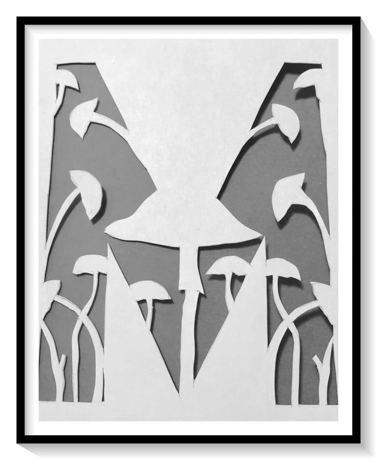
Mis for mushrooms, N is for numbers, O is for ogee, P is for paisley.
Many of the stencils I used were from the StencilGirl ATC collections. The scale was perfect for the size of my letters. I also used a few standard size stencils. For each page shown, I have listed the pattern name. At the bottom of the post I have a list of the StencilGirl Stencils used. 
Q is for quatrefoil, R is for rectangles, S is for stripes, T is for triangles.
Once I understood the balance that was needed between the positive and negative spaces, it was really fun deciding on what pattern would be used for each letter. I do have my favorite pages, but I think the best part was when they were all put together in the journal.
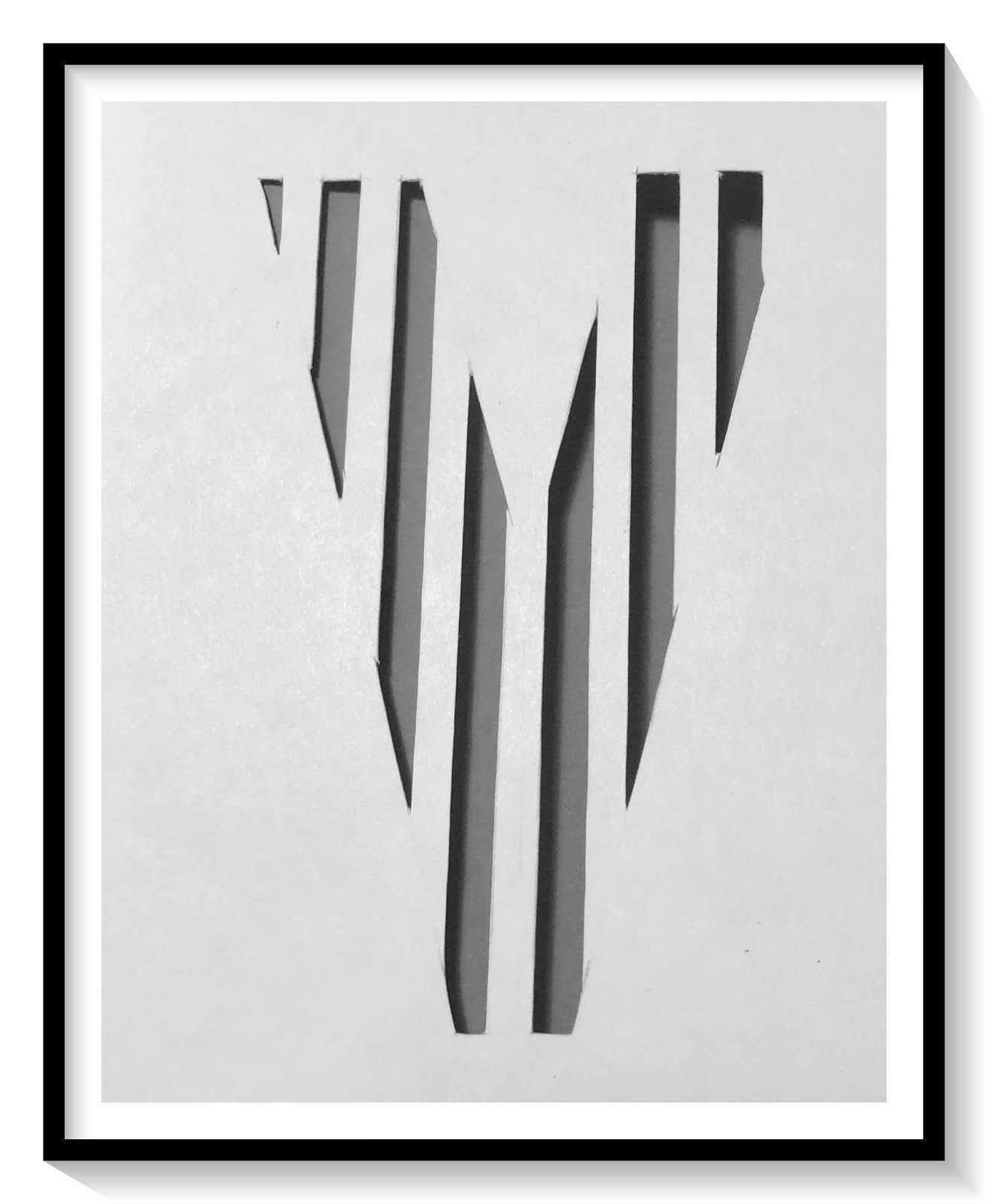
U is for unbalanced stripes, V is for vertical stripes, W is for windowpane, X is for x's.
Using a method of binding I learned in a bookmaking class taught by Seth Apter, I created a binding bar that was the height of the pages. Two pieces of chipboard, wrapped in black paper, create the front and back covers. Each letter page was attached with a sheet of vellum in between.
Y is for yin yang, Z is for zigzag.

Here is a short flip-through video for you to see the book in its entirety. 


I was thrilled to be part of the StencilGirl A to Z challenge. I hope that you can find time to visit the StencilGirl Talk blog to find links to all of the other artists that were a part of the challenge, as well as learn about Tina's fabulous journal and thoughts on the collaborative. 
You can find it here.

Thanks so much for stopping by today, 
I really appreciate you taking the time and hope that I have inspired you to get creative.
~Ann

StencilGirl stencils used: