Thursday, January 20, 2022

finding purpose: unique upcycled bangle bracelets - a StencilGirl® Talk blog post


 Hi everyone, I am excited to be on the StencilGirl® Talk blog today.  I am sharing a tutorial for these unique, upcycled, bangle bracelets, made using my Alphabet Mixup ATC stencils
Like most people, having spent a lot of time in my studio this past year, I noticed there's a lot of space taken up by my stash of collected items. These are the things that I can't seem to possibly throw away, things that have "potential" to be used in alternative ways for projects...things like spent tape rolls. I created five different bangles from tape roll cores, each showcasing a different pattern. I hope you can stop by the StencilGirl® Talk blog to check them all out. 
Perhaps you will be inspired to dig into your stash and create something special. These bracelets would make the perfect gifts, and they can be made using items that you've already got on hand, so they won't cost you anything but time, and in my opinion, any time I can be making art is a good time!


Thanks so much for stopping by today, if you'd like to see my full post on how I created these unique, upcycled, bangle bracelets, be sure to visit the StencilGirl® Talk blog!

 Creatively yours,

Ann

xxx 


StencilGirl stencils:

ATC MixupAlphabet A through I

ATC Mixup Alphabet J through R 

ATC Mixup Alphabet S through Z & 

Monday, October 25, 2021

affirmation deck collaboration for StencilGirl®


Today I am delighted to share the affirmation deck I created for the most recent StencilGirl® collaboration hosted by Tina Walker. I realize it has been a while since I've shared here on the blog; I can't imagine a better project with which to renew my feed. For this collaboration, Tina asked that we "create an Affirmation Deck or Tarot Card Deck in any size, with any mediums, but should highlight StencilGirl® stencils."
As is generally the case when Tina hosts a collaboration, the concept itself sparked my creativity and I began with a swirling of ideas about how my project could come to life. I knew from the start that I wanted to use the Sacred Hearts ATC Mixup stencils by Laurie Mika. The sacred heart being a symbol of love and devotion to all humanity despite the suffering that is endured. 
My faith is an underlying constant in my life regardless of what is going on around me; I wanted my affirmation deck to highlight this. Too often, it is easy to get caught up in the moment and our focus shifts, my hope was that this deck would provide positive insights to push through the most difficult days. 
I began with 4" by 4" mixed media art tiles. One side of each card was layered with PaperArtsy fresco finish paints and collaged with torn pieces of hymn sheet music. More layers of paint and stamping created a base for the sacred heart stencil images. 
Using gold gesso, I sponged a small amount through the stencil onto the background and then set it aside to dry. (Note: be sure to wash the gesso off the stencil before it dries.) The Sacred Heart ATC Mixup stencil contains nine different designs. Using a masking technique, I modified three of the designs to arrive with a set of twelve different cards.
While the gesso was drying, I inked pages of old French text with fired brick and candied apple Distress Ink. Once dry, the pages were spritzed with water to give more depth and a distressed look. I used the stencils as a guide and drew hearts onto the inked pages. The hearts were cut out and incorporated into each design. By using the stencil as a guide, the hearts fit seamlessly into the design. After the hearts were adhered, some of the stencils were placed back onto the image and more gesso was used to replace any portions of the design that may have been covered with the text paper.
Using gold leaf paint, I traced many of the details on each sacred heart design. I filled some areas solid and in others, used the paint to add highlights.
Next I began work on the opposite sides of my cards. The inked, French text papers were used as a base layer for the back side of each card. A fleur-de-lis was stamped randomly onto the backgrounds. I searched  through my stash of religious images and selected twelve different versions of the blessed virgin with child. These images were then cut out and collaged onto the base layer. I used a gold paint pen to add highlights and marks. Using a sea sponge, I added sticky embossing and gold leaf to each background.
Random areas of gold leaf were also added to each card front. In a non-traditional manner, I used a sea sponge to apply embossing ink randomly. I then sprinkled with sticky embossing powder; when the embossing powder was heat set, the leaf was adhered. The extra leaf was rubbed off once the embossing had cooled. 
I compiled a list of positive quotes from various Saints onto a word document and printed it onto gold vellum. Each quote was cut out and attached to the card with a red wax seal. I used the gold paint pen to highlight the raised design within the seal.
Using the remaining scraps of inked French text, I die cut small tattered roses and used them to embellish a few of the sacred heart designs. 
With my affirmation deck complete, I wanted to create a place for safekeeping when the cards were not in use. I had an old fabric bag that held jewelry at some point. I dry brushed the bag with the same paints that were used for the cards. I then selected one of the designs from the Four Sacred Hearts Stencil by Laurie Mika to adorn the bag. Using a fine tip Micron pen, I carefully traced the stencil design onto the fabric. (Note: before beginning any alterations to the fabric bag, cut a piece of cardboard and place it inside to provide a hard surface to work on' the will also prevent any of the paint from seeping through to the back side of the bag.) Using fired brick Distress Paint, I filled in the heart portion of the design and traced the lines of the floral flames extending from the cross. I then used the gold paint pen to color the remaining positions of the design. The paint pen was also used along the drawstring pocket to give a finished edge. 
I look forward to using this affirmation deck to help me in finding peace and positivity among the chaos of these times.
Thank you so much for stopping by the blog today, I really appreciate you taking the time.
If you are interested in seeing any of the other decks from the collaboration, stop over by the StencilGirl® Talk blog today and check out Tina's post. It has links to each of the artists projects and there are some truly incredible decks (tarot as well as affirmation) to see! It's always so interesting to see the different pieces that all begin from the same instructions. This collaboration is definitely worth taking a minute or two of your time to see. Click here to go to the post.

I hope that my deck has inspired you to create something to bring positivity to your days, or perhaps one of the quotes speaks to you and brings you hope.
~ Ann

"All the darkness in the world cannot extinguish the light of a single candle." - St Francis of Assisi


StencilGirl® stencils used:

Sacred Hearts ATC Mixup Stencil (L784) 

Four Sacred Hearts (L782)

Monday, July 26, 2021

creative recipe collaboration for StencilGirl®


It's always a treat to participate in one of Tina Walker's collaborations for StencilGirl®, and the most recent one:       "Cooking with Tina" was no exception. 

The idea behind this collaboration was simple, Tina would create a "creative recipe" that each participant would follow in order to create their own piece of art. Over the course of twelve weeks, each Monday we were given a new ingredient to add to our project, culminating in a completed artwork. We were not given the entire recipe in advance; therefore with each step the piece had to adapt to the new introduction. I decided to complete an art journal spread for this collaboration. 

Week one: prep surface, add two colors of acrylic paint

Using my largest art journal, I added two colors of PaperArtsy Fresco finish paint. I decided that keeping the colors fairly neutral would give me more flexibility for adding the future ingredients.

Week two: add collage material

I added pieces of maps as well as some torn tea/coffee dyed papers along each side of the spread, still keeping with the basic idea of a neutral base to build upon.

Week three: stencil a repeating pattern

At this point, I started getting ideas about the direction I would like my journal spread to take. I envision some sort of architectural approach. In keeping with this idea, I chose the arched aqueduct stencil, and distress ink to create the designs on each of the pages. To maintain balance, I flipped the design along the right hand side. 

Week four: scribble/doodle

Using fluid acrylic paint in a fine liner, I added scribbles along the top and bottom edges of the pages. I also added some lines to accentuate the stencil design and bring it into the foreground.

Week five: opposites

This prompt generated a lot of ideas, ranging from symbols all the way to colors. I settled on using words to express opposites. You will notice the words OPEN and CLOSE. My thoughts behind this choice, since I was still under the assumption this would be some sort of architecture based design, was something along the lines of when one door closes another opens... we will see how that works into the future steps.  

Week six: draw a face

I have to admit, drawing faces is NOT my thing, so I cheated a bit and used a stencil as the basis for my drawn face. I used charcoal with the sweet girl face stencil to draw the basic shape and locations for the features, then went back in with a pencil and attempted to add details. This is THE step that changed the direction of my page. I now had no idea of how this page was going to come together... 

Week seven: add the color red

Adding the color red was not a difficult ingredient to incorporate. I could totally see the sweet girl with a red and white striped shirt, so I repositioned the stencil directly over the face and used a paint pen to color in the striped details on the collar. I also added a red die cut heart "barrette" in her hair.

Week eight: stencil with a Tina Walker stencil

Some of my favorite Tina Walker stencils are from her travels abroad. The cathedral floor stencil was inspired by Jedburgh Abbey from the Scottish borders region. I thought it would be fun to play on my original architecture idea by using this stencil, but in a more whimsical way that would work with the sweet girl that now played a prominent role in my spread. The stencil design became the pattern within butterfly wings that flank the girl. 

Week nine: add ink

Using a water brush, I add distress ink within the butterfly wings, as well as on the sweet girl's cheeks. 

Week ten: add words

Since the art journal spread has detoured from my original thoughts behind the OPEN/CLOSE idea, I used this prompt to add words and create the phrases "close your eyes" and "open your heart". In my mind, this gave the whimsical wings a better tie-in.  

Week eleven: cover something up

This was a no brainer step, I covered up the sweet girl's eyes that I had drawn and were so unhappy with the look of. It also worked well with the "close your eyes" phrase.

Week twelve: add finishing touches

I believe there is still some work to be done on this spread; however, for the sake of completing the collaboration, I "completed" the pages by inking the page edges, adding some bold black marks with the art marks stencil to balance and draw attention to the words, and also added some red thread. As I progressed through this collaboration, the ancient Chinese proverb "an invisible red thread connects those who are destined to meet, regardless of time, place, or circumstance. The thread may stretch or tangle, but it will never break" kept running through my mind, and it was inevitable that it would become integral to the piece.


This was probably one of the most challenging collaborations I have ever done. Since I had no idea what "pieces" would be included, I was never able to get a clear idea for the final result. At times this was frustrating. When I am creating something, even though I don't always know exactly where I am headed, I usually have a general direction and concept. When I tried to keep to an underlying theme, things didn't always work with that idea. Even through all of the detours, I ended up being pleased with the final art journal spread. 


I believe in pushing yourself to try new things and explore beyond your normal boundaries, this is how we experience growth. Thanks so much for taking the time to stop by. I hope that you can visit the some of the other artists that participated in the collaboration, there are so many wonderful projects. You can find Tina's StencilGirl® Talk blog post, including the list of participants here
~Ann 
 x
   

StencilGirl® stencils used:

Arched Aqueduct Stencil (L359) Carolyn Dube

ATC Mixup Missigman Art Marks (L792) Rae Missigman

Cathedral Floor (S822) Tina Walker

Sweet Girl Face small (S859) Jeanne Oliver

Wednesday, May 19, 2021

new architectural stencils for StencilGirl®


Hello everyone, today I am really excited to share my newest StencilGirl® stencil designs: architectural.  There are four new designs in this release. These four stencils are based on residential architectural design, the foundation of my work in architecture. I love the linear quality of architectural plans; each line type and width represents different elements found within the design. A concept is developed into a vision, which begins with a set of plans. 
These stencils are perfect for use in so many different art genres, from art journaling to card making and everything in between. Below are images of the four stencils and a little bit of background on how they came about.


                                                      MASTER SUITE (S871)
One of my favorite aspects of the Master Suite stencil design is the unexpected angled passage that splits the traditional plan. Rectangular spaces throughout the residence sometimes need a shake-up.  Envision yourself encountering a passage that appears to go in an unintended direction, when followed, it brings you to a vaulted space with the finest finishes and the grandest views. This angled corridor brings a lot of interest to the plan as well as the experience, an will also create interest when the stencil is used. 
                                 
This stencil is a 6x6 size and can be used with all mediums: paints, inks, pastes and more. It can be used in small sections or in its entirety. I can also see this stencil being used as a framework for design within an artwork. 


BACK HALL (M330)

This stencil was derived from a floor plan of the more utilitarian areas of the residence. As one enters the back hall they can access the more personal spaces within the residence, a very different experience from the grand entrance of the foyer. These spaces are smaller and more functional. This stencil provides linear graphics with perpendicular intersections and dashed lines. Its small size can have a big impact and would work wonderfully within a linear or grid journaling format. Small sections of the stencil can also be used for mark making.


I envision this 4x4 stencil being used with inks and paints, perhaps even textural pastes to give the appearance of raised lines within a piece of art.  


                                 ORIENTATION (M331)      
Every set of architectural drawings references a building geographically. The elevations are typically labeled north elevation, south elevation and so forth. Each drawing then contains a graphic that relates the “building north” as depicted on the drawing labels to “true” north. These types of orientation graphics can be as simple as overlapping rotated axis or as complex as the architect desires it to be. The orientation stencil is based on my interpretation of this graphic. I like to include an aerial view of the structure atop geographically accurate compass points. 


This 4x4 stencil works wonderfully with paints and inks, as well as embossing and pastes. You can easily utilize portions of the design or the entire graphic. 


                                                 FOYER (S872)
Another of my favorite aspects in architectural design are portals that give glimpses into spaces beyond. Sometimes these offer only subtle hints, other times a full understanding of what lies beyond. The foyer stencil evolved from one of my residential designs. The double story entry contained a barrel-vaulted passage through to the main living space as well as a turned staircase that, when ascended, provided sweeping views of the property all along the upper level corridor. This 6 x 6 stencil contains both large and small openings. It can be used for the simple repetitive patterns that symbolize the stairs and railings or the more open geometric shapes that form the arched passage, trimmed paneling and cased openings, or as a complete architectural design.

This stencil is perfect for use with all different types of mediums. The larger openings are well suited to doodling or filling with color, images or even ephemera. 


Details from an architectural art journal spread:


In this architectural art journal spread, I used the Back Hall (M330) Master Suite (S871) and Orientation (M331) stencils. This art journal spread contains layers of paints and collage materials combined with the stencils. A grid-like design is reminiscent of rooms within a building, creating the perfect spaces to incorporate the stencils during the initial layers. Once the spread began to take shape, pieces of ephemera, collage fodder, gelli prints and vintage papers were included as well as ink and paint through portions of the different stencils. Some of these areas were filled with more collage while others provided opportunities for mark making.


You can find more ideas for creating with my new stencils  on the  StencilGirl® blog today;


and, you can find all my StencilGirl® stencil designs here
I will be sharing more ideas on this blog and my Instagram feed (@aksbarchitect) over the coming days. 
I hope that you love these new stencil designs as much as I do! 
Thanks so much for stopping by today, 
I truly appreciate it.
~Ann
x


Direct links to stencils:


Friday, April 9, 2021

gifts as as easy as ABC - a StencilGirl® Talk blog post

2020-2021 has been a different kind of school year for people everywhere. The educators' roles have been more important than ever. Whether tackling new methods of educating remotely, or simply connecting with students they have never met in person, teachers have dedicated their time and efforts to the cause. With the end of the school year approaching, I have been contemplating ways to show teacher appreciation. Today I am sharing a couple of these ideas on the StencilGirl® Talk blog. You can see the entire post by clicking here.

 The first piece I am sharing is an artsy alphabet mixup pashmina. This lightweight accessory could be used throughout the year in a wardrobe, or as a simple throw. The varied designs in StencilGirl® ATC Mixup Alphabet stencils give this piece a lot of interest and the alphabet shapes lend themselves perfectly to a teacher gift.

Knowing that spring brings many extracurricular and outdoor activities and there may not be much time to make gifts. I am also sharing some simple steps for creating handmade gift enclosures or note cards. The ATC Mixup Alphabet stencils from StencilGirl® are perfect for creating a personalized gift enclosure.

I hope that you have a few minutes to stop by the StencilGirl® blog to check out these projects. Perhaps you will be inspired to create something special to show someone that they are important and appreciated. It's the little things that mean the most.

Thanks so much for taking the time to stop by today, it means a lot to me.

~Ann 


StencilGirl® stencils used:

ATC MixupAlphabet A through I

 ATC Mixup Alphabet J through R

ATC Mixup Alphabet S through Z & 


Monday, January 25, 2021

beautiful minds inspiration collaboration for StencilGirl

Inspiration is all around us, anywhere we look, there is potential for something to set our creative minds afire. So often, a simple walk outside in the early morning hours has influenced my art - whether it was the shadows of a barren tree, the dynamic colors of a sunrise, the sweet smell of thawing earth, or a simple birdsong as nature awakens for the day. For this reason alone, I knew when Tina Walker introduced the concept for beautiful minds inspiration collaboration, I was thrilled to join in. 
You can find Tina's post here with links to all the artists that participated.
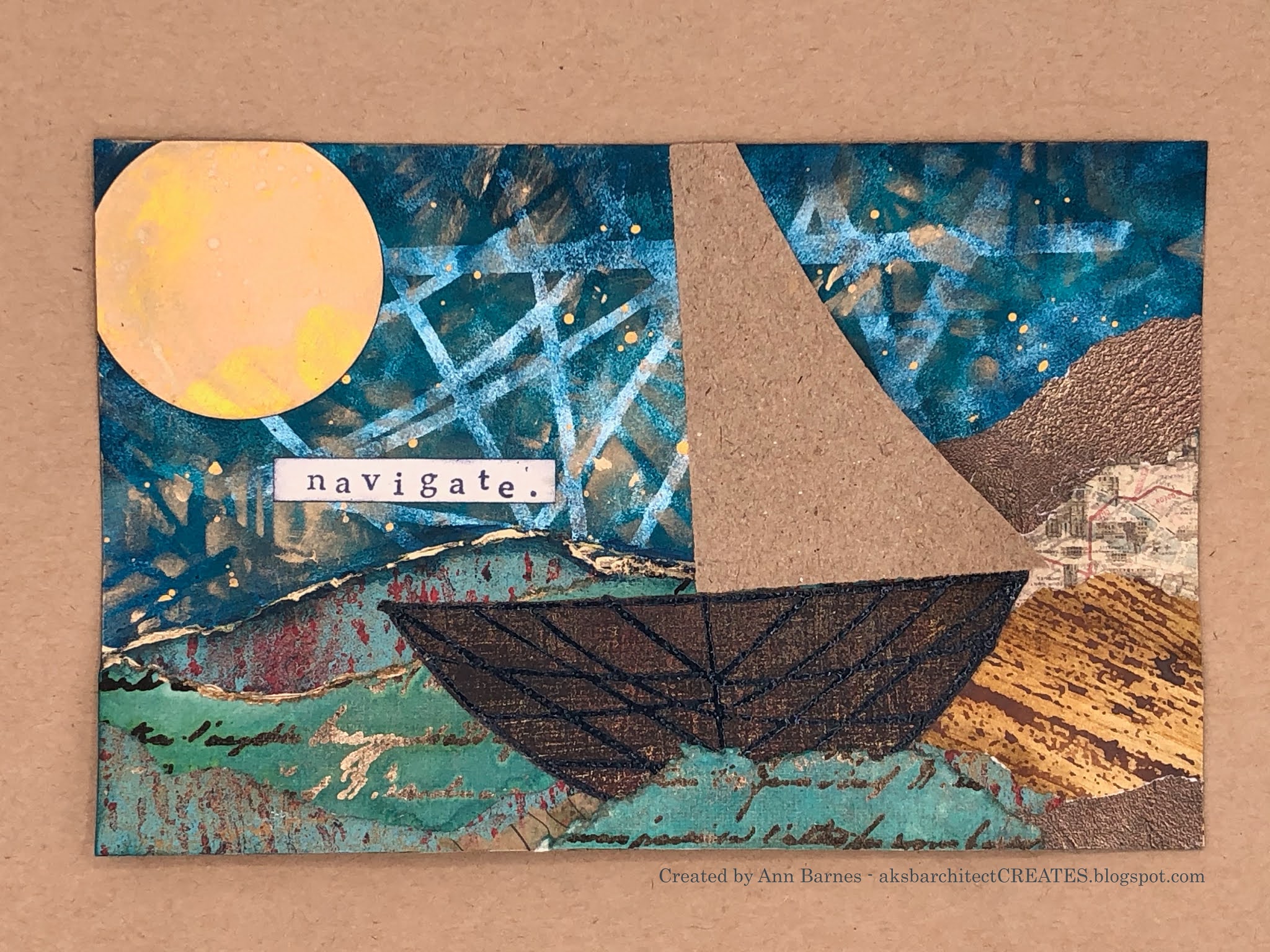
I chose Mary C. Nasser, artist, as my inspiration. Each opportunity I have to admire Mary's art, it takes me to places afar. More often than not, those places involve peaceful seas and gentle breezes, warm hues of blue and green, reminders of sailing the Caribbean Sea many years ago with my family. Much of Mary's art involves collage. She uses vintage elements-charts, maps and text, as well as stencils. Mary has a line of stencils with Stencil Girl Products, a few of which I am fortunate to have among my supplies. For my project I created three mixed media postcards inspired by Mary's style and colors, as well as some recent pieces she created as a creative contributor for the Painted Paper Project. You can find Mary's blog post for her Painted Paper Project: mixed media postcards here
This is a picture of Mary's pieces for that project:
For each of my postcards, I began with either a partially collaged or plain 6" x 9" base and introduced the Navigation Chart large mask with stencil. I wanted to create a series of pieces, not three replicas, thus allowing my "inspiration" to flow from one piece to the next and blend into my own "style" of art. It was important to me that my pieces for this collaboration be inspired by Mary's work, not copies. For me, inspiration is a tiny spark that sets my creative mind spinning, sometimes that spark is clearly reflected in the result and other times, it is hidden, a simple driving force.
Once all three pieces had this initial layer introduced, I then focused on each one separately. Its interesting to see how my first postcard most closely resembles (in my opinion) Mary's work. As I continued to work through each piece, I began to notice more of my own style, while still carrying Mary's inspiration.
It was great having the stencils in varied sizes so that I could layer them within the piece, working from largest to smallest. All of the postcards share a common focal point, the Ancient Mariner's mini mask with stencil. This is one of my favorite stencils in this series, and has always reminded me of the bones of a boat.
I really enjoyed working on this collaboration, it is not often that I set out to have something in particular "inspire" me. So often you hear of artists having a "block" and I believe this would be a wonderful way to work through something like that. 
I hope that you can check out the StencilGirl® Talk blog to see the other amazing inspired projects created for this collaboration. You can get to the post by clicking here
Thank you so much for taking the time to stop by today, I really appreciate it.
there is inspiration everywhere you look, I hope it creates a spark for your creativity.
~Ann
xxx


StencilGirl® stencils used:

Navigation Chart Large Mask with stencil (L738)

Ancient Mariners Map Mini Mask with Stencil (M269) 

Navigation Chart Mini Mask (M271)

Navigation Chart Mask Small (S720)